
原生组件
分析组件可以辅助用户更好的理解数据,发现数据特征。 vGraph 从业务场景中提炼出提供一些通用的原生数据组件,并将持续不断去补充分析能力。
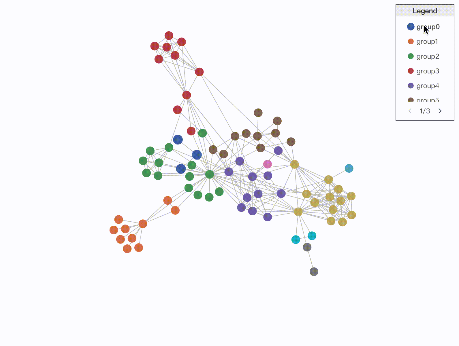
图例 Legend
Legend 图例是可视化中常见的配套组件,用于对图中使用的各种符号和颜色进行说明,帮助用户理解。根据映射的数据特征,图例分为分类图例和连续图例两类。
分类图例
分类图例用于区分不同的数据对象的符号或名称,通常用于表示类别型数据。
import { Graph, CategoryLegend} from '@visactor/vgraph';

const graph = new Graph(...options);
const categoryLegend = new CategoryLegend(graph, {
  container: legendDiv,
  encodeAttr: 'group',
  target: 'node',
  encodeStyles(nodeData) {
    return {
      marker: {
        type: 'circle',
        fillStyle: nodeData.fillStyle,
      },
      label: 'group' + nodeData.group,
    };
  },
  width: 100,
  height: 200,
  hover: {
    // 启用图例项的 hover 交互
    enable: true,
  },
  click: {
    // 启用图例项的 click 交互
    enable: true,
    multiple: true,
  }
} );
| 配置项 | 类型 | 描述 |
|---|---|---|
| width | number | **[必填]**图例容器宽度 |
| height | number | **[必填]**图例容器高度 |
| container | string | HTMLElement | Legend 默认加载到 graph 容器,也可指定挂载容器 |
| padding | number | number[] | 图例边缘留白 |
| legendData | CategoryLegendDataItem[] | 用户自主配置图例项内容。CategoryLegendDataItem 详见下方定义。 |
| encodeAttr | string | **[必填]**图例编码的数据维度。 |
| target | 'node' | 'edge' | 'group' | **[必填]**图例编码的主图元素类别,分为 node、edge、group 三类。 |
| encodeStyles | (nodeData: any) => {} | 配置图例样式。当未定义 legendData ,自动从图中生成图例时使用。 |
| title | LegendTitleConfigs | 图例标题,具体见下方 LegendTitleConfigs 定义。 |
| orient | 'vertical' | 'horizontal' | 图例布局,支持 vertical 垂直布局和 horizontal 水平布局两种,默认为 vertical 布局。 |
| maxLabelWidth | number | 图例项最长文本限制,默认为 100。 |
| pagination | { width?: number; height?: number; textStyle?: {[key:string]:any} //设置文本样式 }; | 分页器样式。当图例项间距小于默认间距时,自动生成翻页。 |
| hover | { enable?: boolean; // 启用 hover 交互 legendActiveState?: string; // 图例焦点元素 state filter?: boolean; // 是否开启主图筛选 graphActiveState?: string; // 主图焦点元素 state graphBlurState?: string; // 主图非焦点元素 state }; | hover 交互,通过 enable 属性启用。在默认状态下激活图例项时,为选中图例项的图形元素放大,文本加粗显示。可以通过在 setLegendStateStyles 中配置 hover 状态样式自定义。在 hover 到图例项时会给对应的主图实体添加 active 状态,可以通过配置 graphActiveState 取消或自定义。 |
| click | { enable?: boolean; // 启用 click 交互 multiple?: boolean; // 允许多选 legendActiveState?: string; // 图例焦点元素 state filter?: boolean; // 是否开启主图筛选 graphActiveState?: string; // 主图焦点元素 state graphBlurState?: string; // 主图非焦点元素 state }; | click 交互,通过 enable 属性启用。在默认状态下启用图例项时,将所选图例元素置灰;主图中所选图例元素对应的节点进行隐藏。 |
| setLegendStateStyles | (state: string, markerData: any) => { [key:string]:any //设置图形样式 textStyles?: {[key:string]:any} //设置文本样式; //设置文本样式 } | 与 hover 和 click 中的 legendActiveState 配合使用,设置图例项在特定状态下的样式。 |
CategoryLegendDataItem
| 配置项 | 类型 | 描述 |
|---|---|---|
| marker | { type?: 'rect' | 'circle' | 'icon' | 'image' | 'line' | 'quadratic' | 'cubic'; // 图例项的图形形状 [key: string]: any; // 图例项的图形样式 } | 图例项中图形的形状和样式配置 |
| label | string | { text: string; // 文本 [key: string]: any; // 文本样式 } | 图例项文本 |
| value | any | 图例项表示的数据维度具体值 |
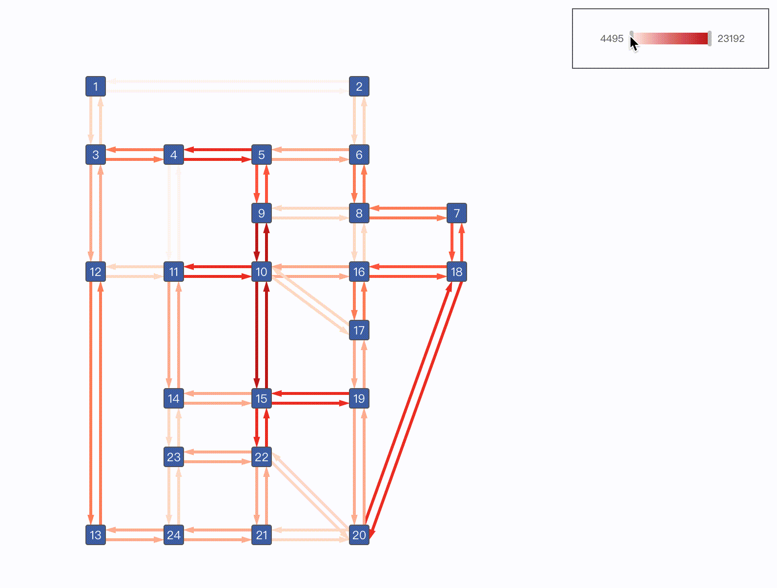
连续图例
连续图例表示数据范围,通常用于数值型数据维度映射。
import { Graph, ContinuousLegend} from '@visactor/vgraph';

const graph = new Graph(...options);
const continuousLegend = new ContinuousLegend(graph, {
  container: legendDiv,
  encodeAttr: 'volume',
  channel: 'strokeStyle',
  target: 'edge',
  width: 200,
  height: 60,
  slide: {
      enable: true,
      filter: true
  }
});
| 配置项 | 类型 | 描述 |
|---|---|---|
| width | number | **[必填]**图例宽度 |
| height | number | **[必填]**图例高度 |
| container | string | HTMLElement | Legend 默认加载到 graph 容器,也可指定挂载容器。 |
| padding | number | number[] | 图例边缘留白 |
| encodeAttr | string | **[必填]**图例编码的数据维度 |
| target | 'node' | 'edge' | 'group' | **[必填]**图例编码的主图元素类别,分为 node、edge、group 三类。 |
| channel | string | 数据维度映射的图形属性,如 fillStyle、lineWidth 等 |
| color | { max: number; min: number; } | 采用颜色映射时采用颜色的最大最小值。 |
| size | { max: number; min: number; } | 采用大小映射时采用大小的最大最小值。 |
| value | { max: number; min: number; } | 进行连续映射时,数据维度采用的最大最小值。当未定义时,自动获取编码数据维度 encodeAttr 的最大最小值。 |
| label | { max: number; min: number; } | 连续映射时的最大最小文本。未定义时,默认采用 value 值作为图例文本。 |
| scale | { type?: 'linear' | 'pow' | 'log'; value?: number; } | 连续映射的映射函数。默认为 linear 映射;当映射函数为 pow 时,默认 value 为2;当映射函数为 log 时,默认 value 为10。 |
| title | LegendTitleConfigs | 图例标题,具体见下方 LegendTitleConfigs 定义。 |
| orient | 'vertical' | 'horizontal' | 图例布局,支持 vertical 垂直布局和 horizontal 水平布局两种,默认为 horizontal 布局。 |
| track | object | 滑轨背景样式设置 |
| rail | { length?: number; // 滑轨长度 size?: number; // 滑轨宽度 [key: string]: any; } | 滑轨样式设置 |
| slide | { enable?: boolean; // 启用滑动交互 filter?: boolean; //是否进行主图筛选 graphActiveState?: string; // 主图焦点元素 state graphBlurState?: string; // 主图非焦点元素 state } | 滑动交互,通过 enable 属性启用。在默认状态下进行滑动筛选交互时,将会隐藏主图中未在所选区间的元素。 |
LegendTitleConfigs
| 配置项 | 类型 | 描述 |
|---|---|---|
| text | string | { text: string; // 文本 [key: string]: any; // 文本样式 } | 标题文本 |
| background | { height?: number; // 滑轨长度 fillStyle?: string; // 滑轨宽度 strokeStyle?: string; } | 标题背景样式 |
文字气泡 Tooltip
Tooltip 是常用的辅助信息展示途径。
import { RawTooltip } from '@visactor/vgraph';

const tooltip = new RawTooltip(graph, {
  target: 'node',
  content(entity: any, type: string) {
    return `${entity.get('label')}: ${entity.get('class')}`;
    },
  });
}, []);
| 配置项 | 类型 | 描述 |
|---|---|---|
| content | (entity: any, type: 'node' | 'edge' | 'group' ) => string | HTML | [必填]tooltip 内容,支持 string 和 html |
| trigger | 'hover' | 'click' | tooltip 触发方式,默认为 hover |
| offset | number[] | tooltip 相对于节点定位的偏移量 |
| className | string | 给 tooltip 容器添加类名 |
| styles | object | 给 tooltip 添加 css 样式 |
| target | 'node' | 'edge' | 'group' | 触发 tooltip 的元素,单选。默认为 'node' |
| triggerId | string | 局部图形响应 tooltip。实体中包含 triggerId 的图形才会触发 tooltip。Tooltip 则会根据此图形来定位。若配置了 triggerId, hover 节点/连线的其他部分不会触发 tooltip |
| showDelay | number | tooltip trigger 为 hover 时出现延时的毫秒数 |
| hideDelay | number | tooltip trigger 为 hover 时消失�延时的毫秒数 |
以下是节点 label 配合 triggerId 的使用方法示例。当 hover 节点 label 时会展示对应的 tooltip。
import { Graph, RawTooltip} from '@visactor/vgraph';
const graph = new Graph({
container: 'graphContainer',
setDefaultNode(node) {
return {
type: 'category',
radius: 2,
width: 80,
height: 20,
label: {
text: node.name,
// 指定 triggerId, Tooltip 会根据此字段匹配和定位
triggerId: 'triggerLabel',
},
};
},
...,
});
const tooltip = new RawTooltip(graph, {
styles: {
border: '1px solid #ccc',
padding: '8px',
borderRadius: '4px',
backgroundColor: '#fff',
},
content(entity: any, type: string) {
return `${entity.get('name')}: ${entity.get('id')}`;
},
target: 'node',
// tooltip 触发�方式
trigger: 'hover',
// 与 label 中配置的 triggerId 对应
triggerId: 'triggerLabel'
});
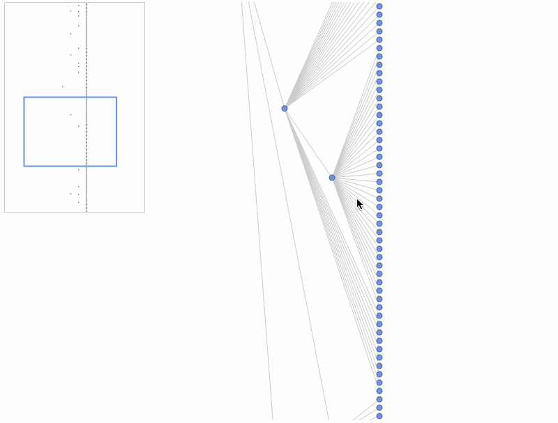
小地图 Minimap
Minimap 可辅助用户概览全局,快速定位。
import { Minimap } from '@visactor/vgraph';

const minimap = new Minimap(graph, {
    container: 'minimapContainerId',
    width: 200,
    height: 300,
    type: 'delegate',
  });
| 配置项 | 类型 | 描述 |
|---|---|---|
| width | number | Minimap 宽度 |
| height | number | Minimap 高度 |
| container | string | HTMLElement | Minimap 默认加载到 graph 容器,也可指定挂载容器 |
| className | string | 指定 Minimap 视窗 css 类名 |
| viewportStyles | object | 设定 Minimap 视窗 css 样式 |
| type | 'delegate' | 'keyShape' | 出于性能考虑,minimap 并不会展示一个节点内所有细节,可以选择用指定图形来代表节点,也可以直接指定为图元的 keyShape |
| showEdges | boolean | 是否在 Minmap 中展示连线,默认为 false |
| getNodeStyles | (node: Node) => Records<string, any> | Minimap 中节点的绘图样式,属性可参考 矩形配置 |
| getEdgeStyles | (edge:Edge) => Records<string, any> | Minimap 中连线的绘图样式,属性可参考连线配置 |
| getGroupStyles | (group: Group) => Records<string, any> | Minimap 中分组的绘图样式,属性可参考 矩形配置 |
| enable | boolean | 是否启用 minimap |
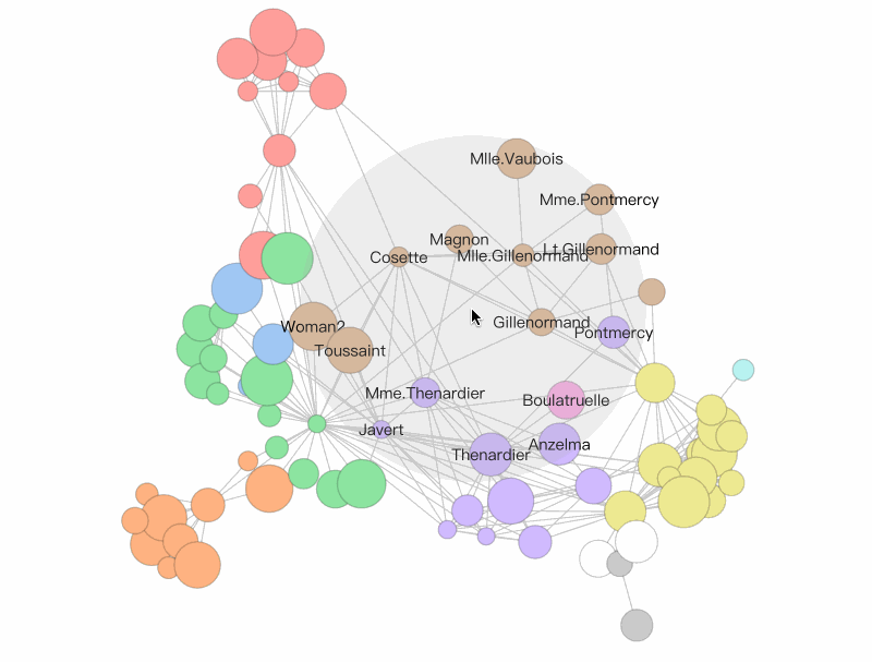
鱼眼放大镜 FisheyePlugin
FisheyePlugin 是鱼眼放大镜组件。在数据量大,数据较为密集的场景下可以辅助用户查看图中信息。也可以在鱼眼放大镜 demo 中亲自体验
import { Graph, FisheyePlugin} from '@visactor/vgraph';

const graph = new Graph(...options);
const fisheyePlugin = new FisheyePlugin(graph, ...options );
| 配置项 | 类型 | 描述 |
|---|---|---|
| bkgShape | boolean | Shape | {} | 辅助显示 inEyeR 范围的背景图形。默认显示 fillStyle: '#AAA', opacity: 0.2 的 Circle 。设置为false、null 或者 undefined 则不显示。也可以传入自定义 Shape 或者传入配置项配置自定义 Circle 。 |
| showLabel | 'node' | 'edge' | 'both' | 'none' | 展示 inEyeR 范围内 Label 的方法。 node 只展示节点标签,edge 只展示范围内节点所连接的边的标签��。both 则都展示。 none 不展示。 |
| coordinateSystem | 'graph' | 'canvas' | 鱼眼作用的坐标系。主要影响缩放时的行为。如果为graph,缩放时鱼眼在graph上的范围不变。如果为canvas则鱼眼在画布上的大小不变。 |
| isSetState | boolean | 是否对节点进行 setState 操作。true 则 setState 'inEye' 或 'outEye'。 |
力导向分组布局 ForceDirectedGrouping
普通的力导向布局无法让不同分组避免重叠。vGraph 研发了一种适用于力导向布局的分组布局组件 ForceDirectedGrouping,该组件通过分组之间的无重叠力来避免分组之间的重叠。 该组件还封装了分组节点的展示和交互。 ForceDirectedGrouping 组件一般结合力导向布局一起使用。 也可以在力导向节点分组布局 demo 中亲自体验。

import { Graph, ForceDirectedGrouping, ForceDirectedLayout} from '@visactor/vgraph';

const graph = new Graph(...options);
const forceGrouping = new ForceDirectedGrouping({graph, options:{...}} );

const fdp = new ForceDirectedLayout(forces:{
    'someforce' : new ForceXXX({
        ...,
        iterationCallback: forceGrouping.groupVelocity,
    }), // 一般放在 ForceCollision 的 iterationCallback上,如果没有,放在其他的 Force 上也可。
},...);
| 配置项 | 类型 | 描述 |
|---|---|---|
| graph | Graph 实例 | [必填] 组件所处理的图数据。 |
| options | ||
| options.getGroupValue | (nodeData)=>value: string | number | undefined | [选填] 识别不同group的节点属性或方法。默认为节点中的'group'属性。如果 value 为undefined则为游离的节点。返回值value必须是string、 number 或 undefined类型。 |
| options.shapeStyles | (groupValue)=>shapeConfigs | 配置groupShape的shape样式,详见Circle的配置项 。目前支持的GroupShape为Circle。 |
| options.extraPadding | number | 配置 Group 之间额外的 padding 半径。默认为 10。 |
| options.shapeDraggable | boolean | 配置是否启用 GroupShape 的拖拽交互。默认为true |
| 实例方法 | 返回值 | 描述 |
|---|---|---|
| groupVelocity | void | 计算Group节点所需移动的位移。一般通过collision force的iteration Callback进行调用。注意: groupingVelocity 内具有 iteration 和 thresholdIteration 变量。 iteration 会在每次调用时自增,仅当 iteration > thresholdIteration 时会实际产生作用。这样做的目的有两个 1. 减少计算量 2. 避免初始阶段破坏初始全局结构。thresholdIteration 默认为 200。 |
| groupVelocity.reset(threshold?:number) | void | 将 iteration 重置为 0, 并将 thresholdIteration 设置为 threshold (如果有)。 |
| groupVelocity.setThreshold(threshold:number) | void | 将 thresholdIteration 设置为 threshold。 |
| updateData(graph:Graph) | void | 更新组件数据 |
| getGroups() | { key: node[] } | 获取所有 Group。key 为 groupValue。 |
| getGroup( filter:(groupValue)=>boolean) | { key: node[] } | 返回满足条件的Group。key 为 groupValue。 |
| updateShapes() | void | 更新GroupShapes的状态。 |
| getAllGroupShapes() | { key : Shape[] } | 返回所有的GroupShape实体。key 为 groupValue。 |
| getGroupShape( filter: (groupValue)=>boolean) | { key : Shape[] } | 返回满足条件的GroupShape实体。key 为 groupValue。 |
| hideShape( filter: (groupValue)=>boolean) | void | 隐藏满足条件的GroupShape实体 (不会对Group造成影响)。 |
| showShape( filter: (groupValue)=>boolean) | void | 展示满足条件的GroupShape实体。 |
| setGetGroupValue( (nodeData)=>value) | void | 修改识别不同group的节点属性或方法。会触发group和GroupShape的变化。 |
| setOptions(options: { ... }); | void | 修改options。其中修改getGroupValue改变会触发group和GroupShape的变化。 |
| on('groupshape:${event}',(ev)=>{}) | void | 订阅交互响应事件。event可以是任意元交互响应事件,如mouseup、mouseenter、touchstart等。也可以是封装好的 ondrag、ondrop、ondragstart、ondragleave、ondragover等拖拽相关的交互。ev.target 为交互的Shape,shape额外挂载了groupValue属性。可以通过对 shape.get('groupValue') 获取。 |
| off('groupshape:${event}') | void | 取消订阅交互事件。 |