内置节点
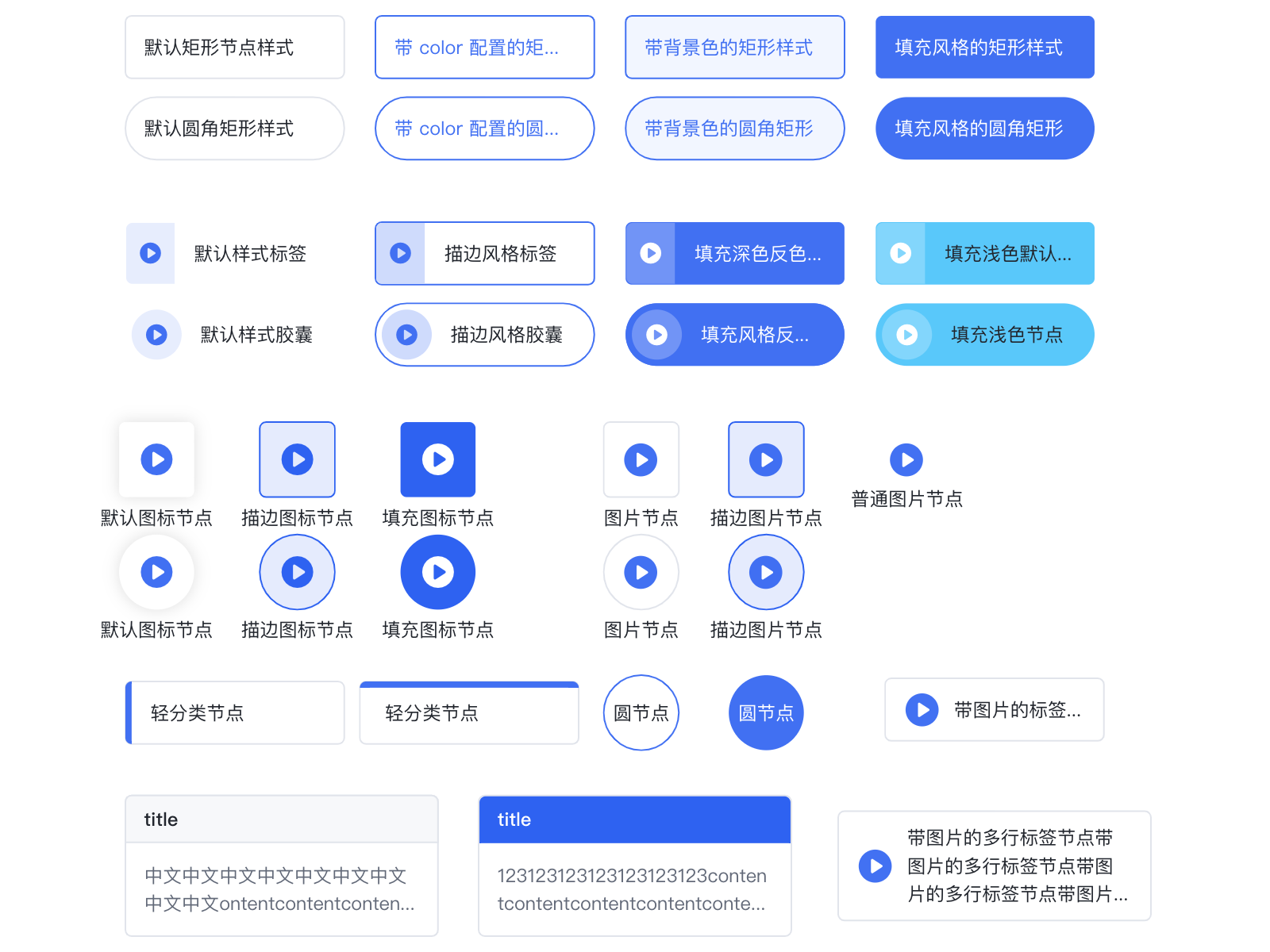
内置节点有以下几种 (rect, circle, image, tittle, category, tag, capsule, icon, imageTag) 。所有内置节点都支持基本图形绘制,锚点,icon,label 文本标签。可见内置节点
内置节点类型
rect
|
| radius | number | number[] | 圆角半径。如为 number, 则四个圆角取相同半径 |
circle
|
| r | number | 圆半径。会覆盖 width。 |
| width | number | 指定圆的半径。r = width/2。 |
rhombus
菱形节点。
|
| radius | number | number[] | 圆角半径。如为 number, 则四个圆角取相同半径 |
image
image 的 KeyShape 一般为矩形,但矩形的圆角半径超过其宽高的一半时,设置 KeyShape 为圆形。image 节点由背景矩形,图片和文本标签三部分组成。这时候配置 strokeStyle 和 fillStyle 字段会在背景矩形上生效,形成图片节点外边框和背景色,如果不配置则是透明底。image 默认结构为图片在上,文本在下。在通用节点的基础上 image 节点支持配置 image 项:
|
| url | string | **[必填]**图片链接 |
| width | number | 图片宽度,默认为节点宽度 |
| height | number | 图片高度,默认为节点高度。如果需展示文本标签,则需要扩大节点高度,设置图片图片高度,为文本标签提出空间。例如上图节点,配置如下: |
{
    id: 'image',
    type: 'image',
    x: 310,
    y: 100,
    width: 115,
    // 节点总高度
    height: 50,
    image: {
      width: 115,
      // 图片高度,剩下高度分配给 label
      height: 28,
      url: 'imageUrl',
    },
    label: 'image',
}
title
此类型在 rect 的基础上扩展出了一个标题文本和标题背景。其中内容文本对应 label 配置,会根�据节点剩余高度自适应排布,支持多行和溢出省略。标题仅支持单行文本,支持溢出省略。title 字段配置如下:
|
| text | string | 标题文本 |
| height | number | 标题高度 |
| borderColor | string | 标题背景边框色 |
| backgroundColor | string | 标题背景填充色 |
| fillStyle | string | 文本颜色 |
| fontSize | number | 文本字号 |
| fontWeight | number | 文本字重 |
其中 title 文字支持的全量配置可见Text 图形配置。上图中 title 节点的定义为:
{
    id: 'nodeId',
    type: 'title',
    x: 120,
    y: 200,
    width: 100,
    height: 60,
    // 标题定义
    title: {
      text: 'title',
      fillStyle: '#666',
      backgroundColor: '#ccc',
    },
    // 内容定义为通用的 Label 配置
    label: '这是一个 title 类型的节点默认样式',
  }
category
category 为带分类色块的矩形节点。此时 color配置的是分类色块的颜色,而 strokeStyle是节点边框色。上图中分类节点的定义为:
{
    id: 'nodeId',
    type: 'category',
    x: 270,
    y: 200,
    width: 100,
    height: 30,
    radius: 2,
    color: '#3073f2',
    label: 'category',
  }
|
| color | string | 色条颜色 |
| position | 'center' | 'top' | 指定色条的位置 |
tag
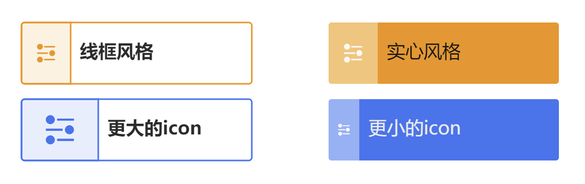
tag 为带 icon 、label 或 title 的圆角矩形节点,color 配置的是主题颜色, theme 可以为 outlined(线框风格)、 filled(实心风格)或者 lighted(亮色风格),默认为lighted,通常情况下不推荐同时使用 icon 和 title。
|
| color | string | 主题颜色,会根据选取的theme自动计算各个部分的实际颜色 |
| theme | 'outlined' | 'filled' | 主题 |
| icon? | String | object | 图标,可以直接使用iconfont,也可以使用对象来定义,size表示icon大小,background可以定义icon部分的背景宽度和背景色。 |
| label | String | object | 定义标签 |
| title? | String | object | 若定义title,则title将作为标题,label作为描述信息 |
{
    type: 'tag',
    x: 100,
    y: 350,
    width: 150,
    height: 40,
    color: '#3073F2',
    label: '更大的icon',
    icon: {
      icon: '',
      size: 25,
      background: {
        width: 50
      }
    },
}
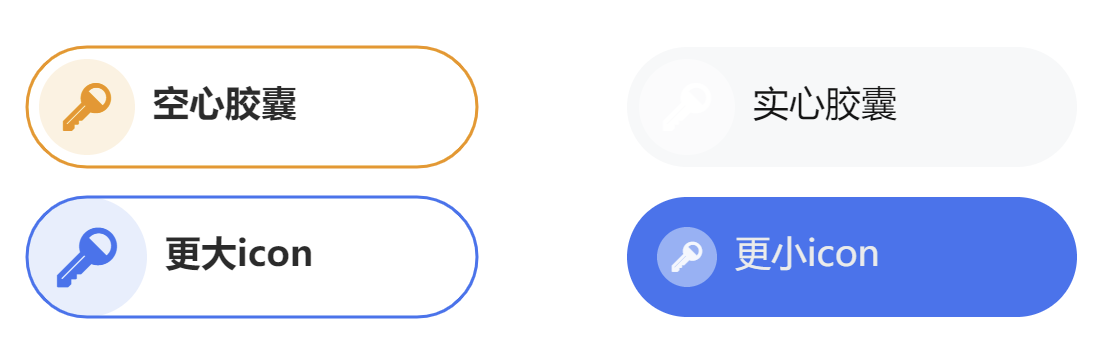
capsule
capsule 为带 icon、title 或 label 的胶囊节点,color 配置的是主题颜色,配置项与 tag 类似,但将 icon.background.width 替换为 icon.background.radius,用于表示 icon 背景圆的半径。
{
    type: 'capsule',
    x: 500,
    y: 350,
    width: 150,
    height: 40,
    color: '#3073F2',
    theme: 'outlined',
    label: '更大icon',
    icon: {
      icon: '',
      size: 20,
      background: {
        radius: 20
      }
    },
}
icon
仅带icon的节点。
|
| color | string | 主题颜色,会根据选取的theme自动计算各个部分的实际颜色 |
| theme | 'outlined' | 'filled' | 主题 |
| icon | string | object | 图标 |
| size | number | 图标大小 |
| label | string | object | 定义标签 |
imageTag
图片和文本标签并排的节点,支持多行文本垂直居中排布。
|
| image | string | object | 节点图片。当类型为 string 时会以默认配置画 url 为 image 的图片。也可传 object 进行进一步自定义。 |
| image.size | number | 图片大小。目前仅支持长宽相等的方形图片。 |
| image.url | string | 图片链接。 |
| label | string | object | 定义文本标签 |
通用配置项
|
| id | string | [必填] 节点的唯一标识,边引用节点的标识 |
| type | 'rect' | 'circle' | 'image' | 'title' | 'category' | 'tag' | 'capsule' | 'icon' | ... | 节点类型。vGraph 内置了 8 种类型的节点,用户也可以基于这些节点类型扩展引用。默认值为 'rect'。具体请见 内置节点 |
| x | number | 节点中心位置的横坐标 |
| y | number | 节点中心位置的纵坐标 |
| width | number | 节点的宽度 |
| height | number | 节点的高度 |
| groupId | string | 节点所属的 group 的 Id |
| color | string | 节点颜色,根据节点类型不同表现不同 |
| label | string | LabelConfigs | 标签文本配置。若为 string,则根据节点类型不同摆放在默认位置。自定义配追具体请见下方 LabelConfigs |
| icons | IconConfigs[] | 设置节点上的图标数组。具体请见下方 IconConfigs |
| anchors | number[][] | AnchorConfigs[] | 设置节点上的锚点。具体请见下方 AnchorConfigs |
KeyShape 配置项
