Vue-VTable自定义组件
自定义单元格组件
为了方便Vue开发者快速实现自定义单元格内容,Vue-VTable 提供了封装组件并在单元格中使用的能力。
组件用法
自定义单元格组件在自定义布局的基础上封装而成,用法类似于自定义布局。在ListColumn中使用组件,通过 #customLayout 插槽和 <ListColumn> 组件可以使用模板的方法自定义列渲染。#customLayout 插槽会返回以下参数:
interface CustomLayoutProps {
  table: ListTable; // 表格实例
  row: number; // 行号
  col: number; // 列号
  value: FieldData; // 单元格展示数据
  dataValue: FieldData; // 单元格原始数据
  rect?: RectProps; // 单元格布局信息
}
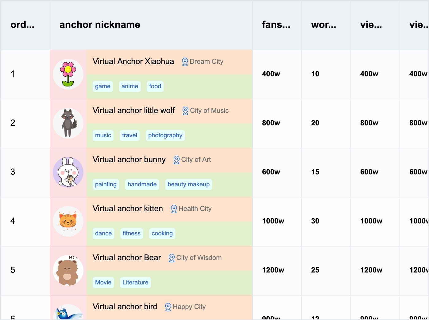
示例代码展示了如何在 ListTable 组件中使用 ListColumn 组件,并通过 #customLayout 插槽自定义列的渲染。具体实现包括使用 Group 组件来布局单元格内容。
import { ListTable, ListColumn } from '@visactor/vue-vtable';
import { Group, Text, Image, Radio, CheckBox, Tag } from '@visactor/vue-vtable';
import * as VTable from '@visactor/vtable';

<ListTable>
  <ListColumn :field="'bloggerName'" :title="'anchor nickname'" :width="330" :style="{ fontFamily: 'Arial', fontWeight: 500 }">

    <template #customLayout="{ table, row, col, rect, record, height, width }">

      <Group :height="height" :width="width" display="flex" flexDirection="row" flexWrap="nowrap">
        <!-- Avatar Group -->
        <Group :height="height" :width="60" display="flex" flexDirection="column" alignItems="center" justifyContent="space-around">
          <Image id="icon0" :width="50" :height="50" :image="record.bloggerAvatar" :cornerRadius="25" />
        </Group>
        <!-- Blogger Info Group -->
        <Group :height="height" :width="width - 60" display="flex" flexDirection="column" flexWrap="nowrap">
          <!-- Blogger Name and Location -->
          <Group :height="height / 2" :width="width" display="flex" alignItems="flex-end">
            <Text ref="textRef" :text="record.bloggerName" :fontSize="13" fontFamily="sans-serif" fill="black" />
            <Image id="location" image="https://lf9-dp-fe-cms-tos.byteorg.com/obj/bit-cloud/VTable/location.svg"
              :width="15" :height="15" :boundsPadding="[0, 0, 0, 10]" cursor="pointer"
              @mouseEnter="handleMoueEnter($event)" @click="handleMouseClick($event)" @mouseLeave="handleMoueLeave($event)" />
            <Text :text="record.city" :fontSize="11" fontFamily="sans-serif" fill="#6f7070" />
          </Group>
          <!-- Tags Group -->
          <Group :height="height / 2" :width="width" display="flex" alignItems="center">
            <Tag v-for="tag in record?.tags" :key="tag" :text="tag" :textStyle="{ fontSize: 10, fontFamily: 'sans-serif', fill: 'rgb(51, 101, 238)' }" :panel="{ visible: true, fill: '#f4f4f2', cornerRadius: 5 }" :space="5" :boundsPadding="[0, 0, 0, 5]" />
          </Group>
        </Group>
      </Group>

    </template>

  </ListColumn>
</ListTable>
组件封装
标签
组件返回的标签,必须是基于 vue-vtable 提供的图元标签(不可以直接使用 HTML 标签或 Vue 组件)
import { ListTable, ListColumn } from '@visactor/vue-vtable';
import { Group, Text, Image, Radio, CheckBox, Tag } from '@visactor/vue-vtable';
import * as VTable from '@visactor/vtable';

<ListTable>
  <ListColumn :field="'bloggerName'" :title="'anchor nickname'" :width="330" :style="{ fontFamily: 'Arial', fontWeight: 500 }">

    <template #customLayout="{ table, row, col, rect, record, height, width }">

      <!-- Blogger Name and Location -->
      <Group :height="height / 2" :width="width" display="flex" alignItems="flex-end">
        <Text ref="textRef" :text="record.bloggerName" :fontSize="13" fontFamily="sans-serif" fill="black" />
        <Image
          id="location"
          image="https://lf9-dp-fe-cms-tos.byteorg.com/obj/bit-cloud/VTable/location.svg"
          :width="15"
          :height="15"
          :boundsPadding="[0, 0, 0, 10]"
          cursor="pointer"
          @mouseEnter="handleMoueEnter($event)"
          @click="handleMouseClick($event)"
          @mouseLeave="handleMoueLeave($event)"
        />
        <Text :text="record.city" :fontSize="11" fontFamily="sans-serif" fill="#6f7070" />
      </Group>

    </template>

  </ListColumn>
</ListTable>
基础图元组件
基础图元:
- Group
- Text
- Image
- Radio
- CheckBox
- Tag
具体配置属性可以参考VRender图元配置,具体使用和布局可以参考自定义布局,参考示例。