


React-VTable自定义组件
自定义单元格组件
为了方便react开发者快速实现自定义单元格内容,React-VTable 提供了封装组件并在单元格中使用的能力。
组件用法
使用自定义单元格组件时,需要使用react 18版本
自定义单元格组件在自定义布局的基础上封装而成,用法类似于自定义布局。在ListColumn中使用组件,自定义组件需要传入role属性,用于标识该组件为自定义单元格组件;其中custom-layout组件会在表格内容部分生效,header-custom-layout组件会在表格表头部分生效。每列中最多只能有一个custom-layout组件,最多只能有一个header-custom-layout组件。
  <ListTable records={records}>
    <ListColumn field={'bloggerName'} title={'bloggerName'} width={330} disableHover={true}>
      <CustomLayoutComponent role={'custom-layout'} info={bodyInfo}/>
      <HeaderCustomLayoutComponent role={'header-custom-layout'} info={headerInfo}/>
    </ListColumn>
    // ......
  </ListTable>
组件封装
默认属性
在组件中,除了用户定义的属性外,与自定义布局一样,react-vtable还提供了一些默认属性供组件使用
interface CustomLayoutProps {
  table: ListTable; // 表格实例
  row: number; // 行号
  col: number; // 列号
  value: FieldData; // 单元格展示数据
  dataValue: FieldData; // 单元格原始数据
  rect?: RectProps; // 单元格布局信息
}
const CustomLayoutComponent = (props: CustomLayoutProps & UserProps) => {
  const { table, row, col, rect, text } = props;
  // ......
}
标签
组件返回的标签,必须是基于react-vtable提供的图元标签(不可以直接使用HTML标签或DOM react组件,如果需要使用,请参考下一节)
import { Group, Text } from '@visactor/react-vtable';

const CustomLayoutComponent = (props: CustomLayoutFunctionArg & { text: string }) => {
  const { table, row, col, rect, text } = props;
  if (!table || row === undefined || col === undefined) {
    return null;
  }
  const { height, width } = rect || table.getCellRect(col, row);
  const [hover, setHover] = useState(false);

  const fieldData = [
    {
      value: 'a',
      label: 'a'
    },
    {
      value: 'b',
      label: 'b'
    }
  ];

  const groupRef = useRef(null);

  return (
    <Group
      attribute={{
        width,
        height,
        display: 'flex',
        flexWrap: 'wrap',
        alignItems: 'center',
        alignContent: 'center'
      }}
      ref={groupRef}
    >
      {fieldData.map(item => {
        return (
          <Text
            key={item.value}
            attribute={{
              text: `${text}-${row}`,
              fill: hover ? 'red' : '#000'
            }}
            onMouseEnter={(event: any) => {
              // eslint-disable-next-line no-console, no-undef
              console.log('groupRef', groupRef.current);
              setHover(true);
              event.currentTarget.stage.renderNextFrame();
            }}
            onMouseLeave={(event: any) => {
              setHover(false);
              event.currentTarget.stage.renderNextFrame();
            }}
          />
        );
      })}
      {hover && (
        <Text
          attribute={{
            text: 'hover',
            fill: 'blue',
          }}
        />
      )}
    </Group>
  );
};
基础图元组件
基础图元:
- Text 文字
- Rect 矩形
- Image 图片
- Line 线
- Arc 弧形
- Circle 圆
- Group 图元组
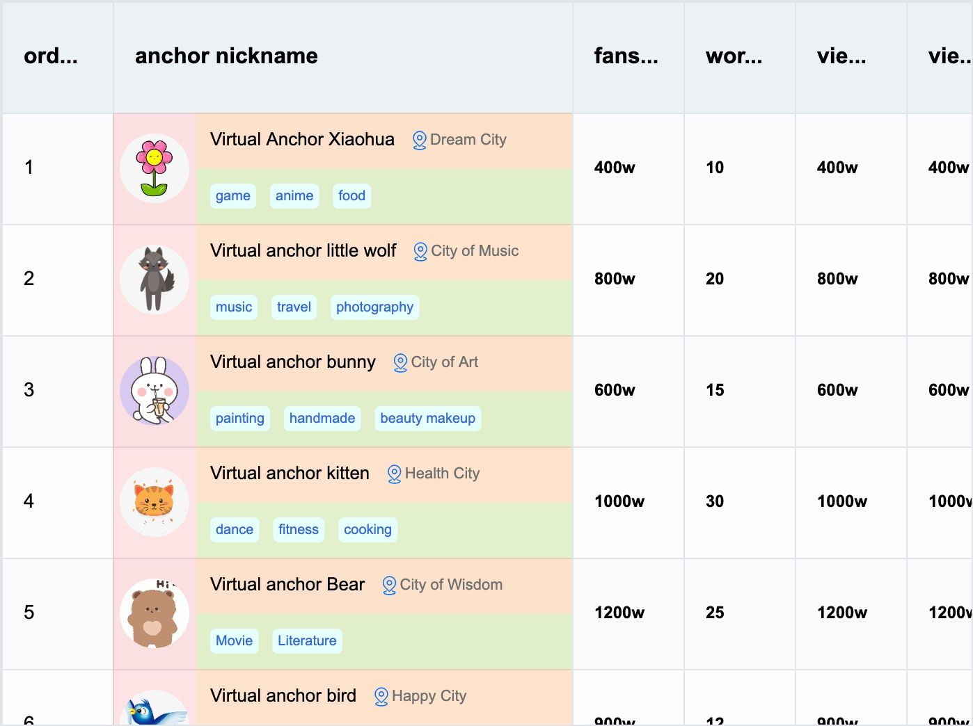
具体配置属性可以参考VRender图元配置,具体使用和布局可以参考自定义布局,参考示例。
React-VTable组件
为了方便用户快速实现自定义单元格内容,React-VTable提供了一些表格场景中常用的组件:
Tag
文字标签
API
| 属性 | 类型 | 说明 |
|---|---|---|
| text | string | 文字内容 |
| textStyle | TextStyleOption | 文字样式 |
| panelStyle | RectStyleOption | 标签背景样式 |
| padding | number | number[] | 内边距 |
| minWidth | number | 标签最大宽度 |
| maxWidth | number | 标签最小宽度 |
Radio
单选框
API
| 属性 | 类型 | 说明 |
|---|---|---|
| text | string | 文字内容 |
| textStyle | TextStyleOption & {disableFill?: string} | 文字样式 |
| circleStyle | ArcStyleOption & {disableFill?: string;checkedFill?: string;checkedStroke?: string;disableCheckedFill?: string;disableCheckedStroke?: string;} | 圆形选中图标样式 |
| interactive | boolean | 是否可交互 |
| disabled | boolean | 是否禁用单选框 |
| checked | boolean | 是否选中 |
| cursor | Cursor | cursor样式 |
| disableCursor | Cursor | 禁用时cursor样式 |
| spaceBetweenTextAndIcon | number | 图标文字间距 |
| onChange | (checked: boolean) => void | 选中状态改变回调 |
Checkbox
复选框
API
| 属性 | 类型 | 说明 |
|---|---|---|
| text | string | 文字内容 |
| textStyle | TextStyleOption & {disableFill?: string} | 文字样式 |
| boxStyle | RectStyleOption & {disableFill?: string;checkedFill?: string;checkedStroke?: string;disableCheckedFill?: string;disableCheckedStroke?: string;} | 选中图标样式 |
| iconStyle | ImageStyleOption & {{checkIconImage?: string | HTMLImageElement | HTMLCanvasElement;indeterminateIconImage?: string | HTMLImageElement | HTMLCanvasElement;}} | 选中图标背景样式 |
| interactive | boolean | 是否可交互 |
| disabled | boolean | 是否禁用单选框 |
| checked | boolean | 是否选中 |
| indeterminate | boolean | 是否显示不确定状态 |
| cursor | Cursor | cursor样式 |
| disableCursor | Cursor | 禁用时cursor样式 |
| spaceBetweenTextAndIcon | number | 图标文字间距 |
| onChange | (checked: boolean) => void | 选中状态改变回调 |
Button
按钮
API
| 属性 | 类型 | 说明 |
|---|---|---|
| textStyle | TextStyleOption | 文字样式 |
| panelStyle | RectStyleOption | 背景样式 |
| padding | number | number[] | 内边距 |
| disabled | boolean | 是否禁用 |
| cursor | Cursor | cursor样式 |
| minWidth | number | 按钮最小宽度 |
| maxWidth | number | 按钮最大宽度 |
| onClick | (event: MouseEvent) => void | 点击事件回调 |
| state | {textStyle?: {hover?: TextStyleOption;disabled?: TextStyleOption;};panelStyle?: {hover?: RectStyleOption;disabled?: RectStyleOption;};} | 状态样式 |
Link
链接
API
| 属性 | 类型 | 说明 |
|---|---|---|
| textStyle | TextStyleOption | 文字样式 |
| panelStyle | RectStyleOption | 背景样式 |
| disabled | boolean | 是否禁用 |
| cursor | Cursor | cursor样式 |
| minWidth | number | 链接最小宽度 |
| maxWidth | number | 链接最大宽度 |
| onClick | (event: MouseEvent) => void | 点击事件回调 |
| state | {textStyle?: {hover?: TextStyleOption;disabled?: TextStyleOption;};panelStyle?: {hover?: RectStyleOption;disabled?: RectStyleOption;};} | 状态样式 |
| icon | boolean | 是否显示左侧图标 |
| space | number | 图标与文字间距 |
| href | string | 链接地址 |
Avatar
头像
API
| 属性 | 类型 | 说明 |
|---|---|---|
| textStyle | TextStyleOption | 文字样式 |
| panelStyle | RectStyleOption | 背景样式 |
| size | number | 尺寸 |
| shape | 'circle' | 'square' | 形状 |
| autoFixFontSize | boolean | 是否自动调整字体大小 |
| onClick | (event: MouseEvent) => void | 点击事件回调 |
Popover
气泡卡片
需要注意,Popover组件使用DOM方案,需要在ReactDOM属性中传入ReactDom,否则无法正常渲染;content属性接收的ReactNode类型,需要是DOM标签或组件,否则无法正常渲染。
API
| 属性 | 类型 | 说明 |
|---|---|---|
| defaultPopupVisible | boolean | 是否默认显示气泡卡片 |
| popupVisible | boolean | 气泡卡片是否显示 |
| position | 'top' | 'tl' | 'tr' | 'bottom' | 'bl' | 'br' | 'left' | 'lt' | 'lb' | 'right' | 'rt' | 'rb' | 气泡卡片位置 |
| content | ReactNode | 气泡卡片内容(DOM标签或组件) |
React-VTable组件库正在持续丰富中,欢迎开发者在使用中封装新的组件,一起共建组件库生态。
使用DOM react组件
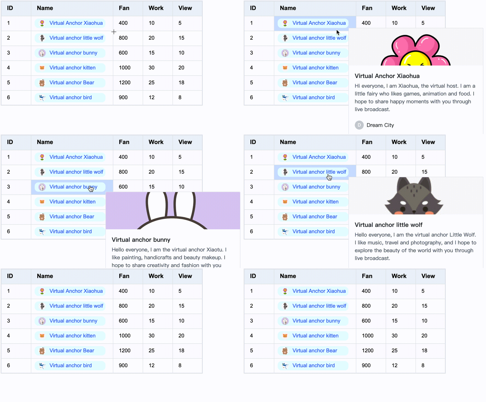
如果需要在组件中使用DOM react组件,可以在图元组件的attribute属性中,指定react属性,并将react组件作为element属性传入:
<Group
  attribute={{
    // ......
    react: {
      pointerEvents: true,
      container: table.bodyDomContainer, // table.headerDomContainer
      anchorType: 'bottom-right',
      element: <CardInfo record={record} hover={hover} row={row} />
    }
  }}
  onMouseEnter={(event) => {
    setHover(true);
    event.currentTarget.stage.renderNextFrame();
  }}
  onMouseLeave={(event) => {
    setHover(false);
    event.currentTarget.stage.renderNextFrame();
  }}
>
// ...
</Group>
react中还支持配置以下属性:
pointerEvents是否响应鼠标事件penetrateEventList鼠标事件穿透列表,用于指定哪些鼠标事件需要穿透到VTable(目前暂时只支持wheel)container容器,用于限制滚动时组件显示区域在表格中,如果需要限制组件显示在表格内容区域,需要指定为table.bodyDomContainer;如果需要限制组件显示在表格表头区域,需要指定为table.headerDomContainer;如果是弹窗或菜单类组件,不需要配置该属性anchorType锚定类型,用于指定组件左上角相对于单元格的锚定位置- 'top'
- 'bottom'
- 'left'
- 'right'
- 'top-right'
- 'top-left'
- 'bottom-right'
- 'bottom-left'
- 'center'
我们推荐用户在单元格内展示的内容,使用react-vtable提供的图元标签,单元格内触发的弹窗、菜单等组件,可以使用DOM react组件,这样是性能最优的方案。参考示例。
如果需要在单元格内展示的内容,使用DOM react组件,需要按照限制组件显示在表格内容区域,指定react.container。需要注意,这样的方式需要频繁更新组件相关DOM,会对性能有一定影响,可以参考自定义布局。我们强烈推荐将单元格内的内容组件使用react-vtable提供的图元标签,这样是性能最优的方案。
自定义外部组件
为了方便在 React-VTable 组件上叠加外部组件,React-VTable 提供了CustomComponent工具组件,方便快速将外部组件定位到表格当中,可以用来快速实现弹窗、菜单等功能组件。
<ListTable option={option} onMouseEnterCell={updatePos} onMouseLeaveTable={hide} onReady={ready}>
  <CustomComponent width="50%" height="100%" displayMode="cell" col={col} row={row} anchor="bottom-right" dx="-50%">
    <UserComponent value={value} />
  </CustomComponent>
</ListTable>
其中,CustomComponent作为一个容器,用于在表格中定位,并自动匹配尺寸(基于锚定的单元格),具体有两种使用方式:
-
绝对定位
绝对定位的方式,需要指定
displayMode为position, 需要指定x和y属性,用于将容器定位到表格中的指定像素位置(基于左上角),width和height属性指定容器的像素尺寸。 -
相对定位
相对定位的方式,需要指定
displayMode为cell,容器相对为单元格定位、col和row属性用于指定锚定的单元格坐标,anchor属性指定容器相对于单元格的锚定位置,dx和dy属性指定容器相对于锚定单元格的偏移量,width和height属性指定容器的尺寸,其中dxdywidth和height属性的均支持单位为像素或百分比,为百分比时,相对于单元格的尺寸进行计算。
API
interface CustomComponentProps {
  children: React.ReactNode;
  displayMode: 'position' | 'cell'; // 定位方式
  col?: number; // 锚定的列坐标
  row?: number; // 锚定的行坐标
  anchor?:
    | 'top-left'
    | 'top-center'
    | 'top-right'
    | 'middle-left'
    | 'middle-center'
    | 'middle-right'
    | 'bottom-left'
    | 'bottom-center'
    | 'bottom-right'; // 锚定的位置
  dx?: number | string; // x方向的偏移
  dy?: number | string; // y方向的偏移
  width?: number | string; // 容器的宽度
  height?: number | string; // 容器的高度
}
自定义外部组件 demo:custom component demo