


tooltip 介绍
在表格组件中,tooltip(信息提示)是一种常见的用户界面元素,用于提供关于特定表格单元格或数据的额外信息。它以一个小型弹出窗口或浮动框的形式出现,当用户将鼠标悬停在特定单元格上或与特定元素交互时,显示相关的提示文本。
tooltip 的使用场景
-
数据解释和描述:某些表格中的数据可能需要额外的解释或描述。Tooltip 可以用于显示这些解释,帮助用户理解数据的含义、单位、计算方法或其他相关信息。
-
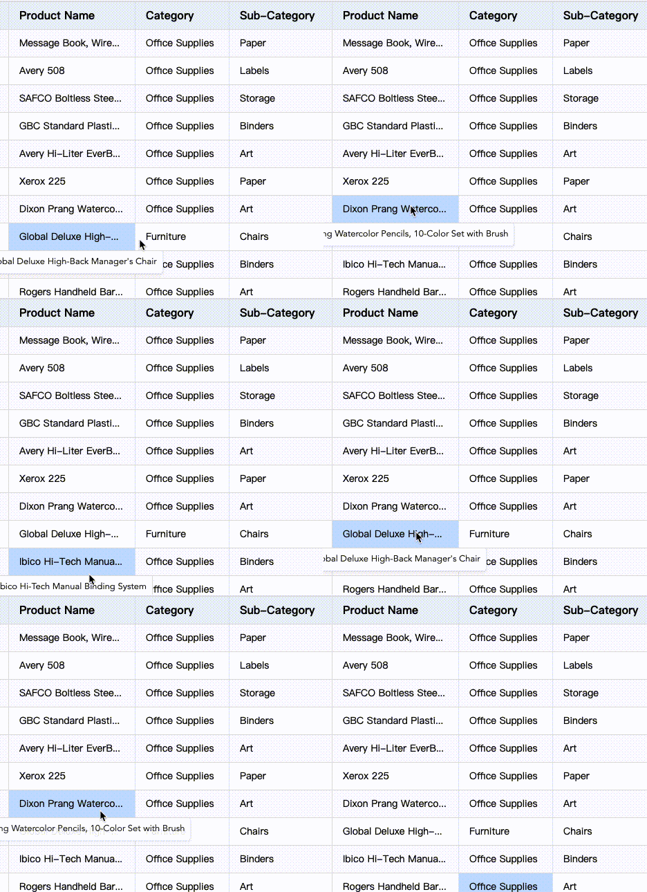
溢出内容:当表格中的文本或数据超出单元格的宽度时,可以使用 tooltip 显示完整的内容,以防止截断或隐藏重要信息。
-
可交互元素说明:如果表格中包含可交互的元素(如链接、按钮或图标),Tooltip 可以用于提供这些元素的功能说明或操作提示。
配置项介绍
配置项为:
{
  /** 提示弹框的相关配置。消失时机:显示后鼠标移动到指定区域外或者进入新的单元格后自动消失*/
  tooltip: {
    /** 渲染方式:如使用html具有较好灵活性,上层可以覆盖样式;canvas具有较好的跨平台展示稳定性 */
    renderMode?: 'html' | 'canvas';
    /** 是否显示缩略文字提示框 */
    isShowOverflowTextTooltip: boolean;
    /** 缩略文字提示框 延迟消失时间 */
    overflowTextTooltipDisappearDelay?: number;
    /** 弹框是否需要限定在表格区域内 */
    confine: boolean;
  };
}
tooltip 提示框的样式设置
tooltip 的样式配置可以通过 theme.tooltipStyle 来进行设置,具体配置如下:
export type TooltipStyle = {
  fontFamily?: string;
  fontSize?: number;
  color?: string;
  padding?: number[];
  bgColor?: string;
  maxWidth?: number;
  maxHeight?: number;
};
开启溢出内容提示
VTable 默认开启溢出内容的 tooltip:isShowOverflowTextTooltip 默认为 true。如果需要延迟消失以使得鼠标可以移动到 tooltip 内容上,可以配置 overflowTextTooltipDisappearDelay。
自定义图标 hover 提示
如配置表头 icon 图标具体如下:
const tableInstance = new VTable.ListTable({
  columns: [
    {
      field: 'orderID',
      title: '订单编号',
      headerIcon: {
        type: 'svg', //指定svg格式图标,其他还支持path,image
        svg: `<svg xmlns="http://www.w3.org/2000/svg" width="12" height="12" viewBox="0 0 12 12" fill="none">
        <path d="M1.29609 1C0.745635 1 0.444871 1.64195 0.797169 2.06491L4.64953 6.68988V9.81861C4.64953 9.89573 4.69727 9.9648 4.76942 9.99205L7.11236 10.877C7.27164 10.9372 7.4419 10.8195 7.4419 10.6492V6.68988L11.2239 2.06012C11.5703 1.63606 11.2685 1 10.721 1H1.29609Z" stroke="#141414" stroke-opacity="0.65" stroke-width="1.18463" stroke-linejoin="round"/>
        </svg>`,
        width: 20,
        height: 20,
        name: 'filter', //定义图标的名称,在内部会作为缓存的key值
        positionType: VTable.TYPES.IconPosition.absoluteRight, // 指定位置,可以在文本的前后,或者在绝对定位在单元格的左侧右侧
        visibleTime: 'mouseenter_cell', // 显示时机, 'always' | 'mouseenter_cell' | 'click_cell'
        hover: {
          // 热区大小
          width: 26,
          height: 26,
          bgColor: 'rgba(22,44,66,0.5)'
        },
        tooltip: {
          style: { arrowMark: false },
          // 气泡框,按钮的的解释信息
          title: '过滤',
          placement: VTable.TYPES.Placement.right,
          disappearDelay: 1000,
        }
      }
    }
  ]
});
其中 headerIcon 中的 tooltip 即是鼠标 hover 到 icon 上的提示框,同时配置了 disappearDelay 使弹出框可以延迟消失以便得鼠标可以移动到 tooltip 内容上。
关于 icon 的配置具体参考教程:https://visactor.io/vtable/guide/custom_define/custom_icon。
通过接口显示 tooltip 自定义信息
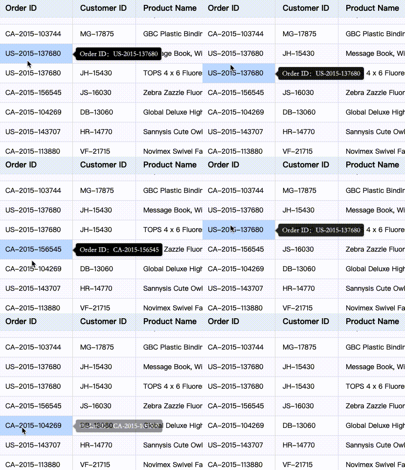
接口 showTooltip 可主动显示 tooltip 信息,如下使用方式:(监听单元格 hover 事件,调用接口) 参考接口说明
  tableInstance.on('mouseenter_cell', (args) => {
        const { col, row, targetIcon } = args;
        if(col===0&&row>=1){
          const rect = tableInstance.getVisibleCellRangeRelativeRect({ col, row });
          tableInstance.showTooltip(col, row, {
            content: 'Order ID:'+tableInstance.getCellValue(col,row),
            referencePosition: { rect, placement: VTable.TYPES.Placement.right }, //TODO
            className: 'defineTooltip',
            appearDelay: 500,
            style: {
              bgColor: 'black',
              color: 'white',
              font: 'normal bold normal 14px/1 STKaiti',
              arrowMark: true,
            },
            disappearDelay: 100,
          });
        }
    });
效果:
icon 的 tooltip 配置
当自定义 icon 时,可以通过配置 tooltip 来显示提示信息,如下使用方式:
VTable.register.icon('order', {
  ... //其他配置
  tooltip: {
    // 气泡框,按钮的的解释信息
    title:'Order ID is the unique identifier for each order',
    style: {
      fontSize: 14,
      fontFamily: 'Arial',
      padding: [10,10,10,10],
      bgColor: 'black',
      arrowMark: true,
      color: 'white',
      maxHeight: 100,
      maxWidth: 200
    },
    disappearDelay: 1000
  }
})