


自定义渲染自动布局
简介
本篇教程主要介绍如何使用 CustomLayout 实现自动布局。
- 注意 :如果您想通过定义坐标来实现完全自定义可以参考教程: CustomRender, CustomRender 写法支持用户自定义单元格内需要渲染需要的元素,使用时通过回调函数返回元素数组,指定元素的类型、样式和坐标(VTable CustomRender 布局能力设计 )。不过该使用方式比较底层,如果用户希望实现一个复杂的样式,需要手动计算各个元素的位置,手动处理对齐、换行等功能,上手比较困难,可维护性较低。-
通过 CustomLayout 是在 CustomRender API 的基础上,提供一套简单盒模型布局能力,用户通过配置容器与元素,实现对齐、折行等基础布局能力,方便实现与维护较为复杂的单元格内容。VTable使用VRender提供的图元和布局能力实现customLayout功能,目前推荐使用 JSX 写法,层级结构更加清晰,参考示例。
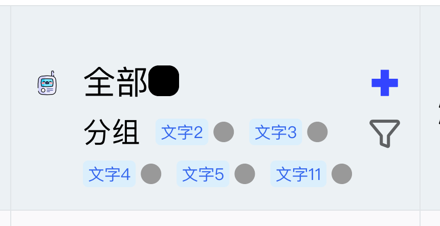
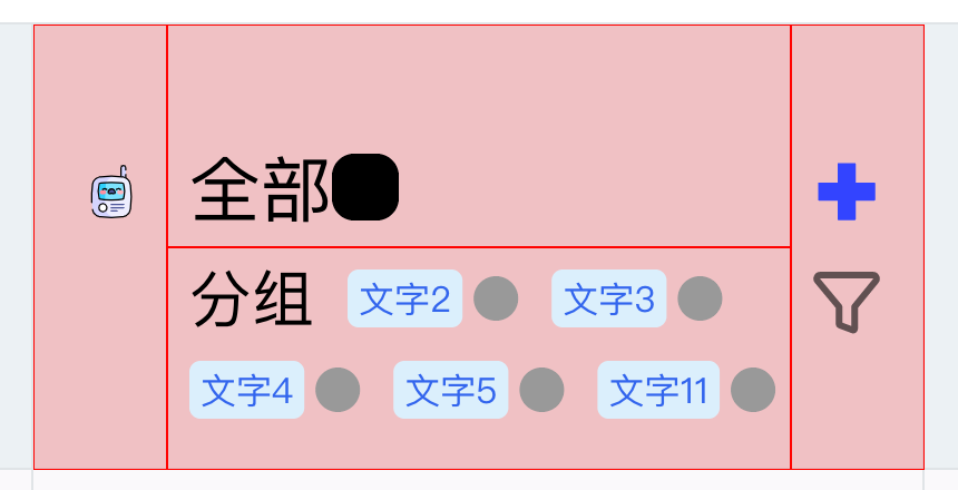
下面是一个相对复杂的文字图标混排布局,使用 CustomLayout 实现(红色为不同容器 bounds):
CustomLayout 配置
与 customRender 类似,customLayout 也分为customLayout和headerCustomLayout两个接口分别来配置表头和内容的自定义渲染,在 columns/rows 中配置
const option = {
  columns: [
    {
      // ......
      customLayout: (args: VTable.TYPES.CustomRenderFunctionArg) => {
        // ......
      }
    }
  ]
};
customLayout 函数返回一个对象,该对象需要有:rootContainer来指定自定义渲染内容的根节点,renderDefault指定是否需要绘制单元格原内容(与 customRender 一致)。
举一个配置示例,如下示例中使用到了 VGroup,VImage,VText,最后将其返回:
{
  customLayout: args => {
    const { table, row, col, rect } = args;
    const { height, width } = rect ?? table.getCellRect(col, row);
    const record = table.getCellOriginRecord(col, row);

    const container = (
      <VGroup
        attribute={{
          id: 'container',
          width,
          height,
          display: 'flex',
          flexWrap: 'wrap',
          justifyContent: 'flex-start',
          alignContent: 'center'
        }}
      >
        <VGroup
          attribute={{
            id: 'container-left',
            width: 60,
            height,
            fill: 'red',
            opacity: 0.1,
            display: 'flex',
            justifyContent: 'space-around',
            alignItems: 'center'
          }}
        >
          <VImage
            attribute={{
              id: 'icon0',
              width: 50,
              height: 50,
              image: record.bloggerAvatar,
              cornerRadius: 25
            }}
          ></VImage>
        </VGroup>
        <VGroup
          id="container-right"
          attribute={{
            id: 'container-right',
            width: width - 60,
            height,
            fill: 'yellow',
            opacity: 0.1,
            display: 'flex',
            flexDirection: 'column',
            justifyContent: 'space-around',
            alignItems: 'center'
          }}
        >
          <VGroup
            attribute={{
              id: 'container-right-top',
              fill: 'red',
              opacity: 0.1,
              width: width - 60,
              height: height / 2,
              display: 'flex',
              flexWrap: 'wrap',
              justifyContent: 'flex-start',
              alignItems: 'center'
            }}
          >
            <VText
              attribute={{
                id: 'bloggerName',
                text: record.bloggerName,
                fontSize: 13,
                fontFamily: 'sans-serif',
                fill: 'black',
                textAlign: 'left',
                textBaseline: 'top',
                boundsPadding: [0, 0, 0, 10]
              }}
            ></VText>
            <VImage
              attribute={{
                id: 'location-icon',
                width: 15,
                height: 15,
                image:
                  '<svg t="1684484908497" class="icon" viewBox="0 0 1024 1024" version="1.1" xmlns="http://www.w3.org/2000/svg" p-id="2429" width="200" height="200"><path d="M512 512a136.533333 136.533333 0 1 1 136.533333-136.533333 136.533333 136.533333 0 0 1-136.533333 136.533333z m0-219.272533a81.92 81.92 0 1 0 81.92 81.92 81.92 81.92 0 0 0-81.92-81.92z" fill="#0073FF" p-id="2430"></path><path d="M512 831.214933a27.306667 27.306667 0 0 1-19.2512-8.055466l-214.493867-214.357334a330.5472 330.5472 0 1 1 467.490134 0l-214.357334 214.357334a27.306667 27.306667 0 0 1-19.387733 8.055466z m0-732.091733a275.933867 275.933867 0 0 0-195.106133 471.04L512 765.269333l195.106133-195.106133A275.933867 275.933867 0 0 0 512 99.1232z" fill="#0073FF" p-id="2431"></path><path d="M514.321067 979.490133c-147.456 0-306.107733-37.000533-306.107734-118.3744 0-45.602133 51.746133-81.92 145.681067-102.4a27.306667 27.306667 0 1 1 11.605333 53.384534c-78.370133 17.066667-102.673067 41.915733-102.673066 49.015466 0 18.432 88.064 63.761067 251.4944 63.761067s251.4944-45.192533 251.4944-63.761067c0-7.3728-25.258667-32.768-106.496-49.834666a27.306667 27.306667 0 1 1 11.195733-53.384534c96.6656 20.343467 150.186667 56.9344 150.186667 103.2192-0.273067 80.964267-158.9248 118.3744-306.3808 118.3744z" fill="#0073FF" p-id="2432"></path></svg>',
                boundsPadding: [0, 0, 0, 10]
              }}
            ></VImage>
            <VText
              attribute={{
                id: 'locationName',
                text: record.city,
                fontSize: 11,
                fontFamily: 'sans-serif',
                fill: '#6f7070',
                textAlign: 'left',
                textBaseline: 'top'
              }}
            ></VText>
          </VGroup>
          <VGroup
            attribute={{
              id: 'container-right-bottom',
              fill: 'green',
              opacity: 0.1,
              width: width - 60,
              height: height / 2,
              display: 'flex',
              flexWrap: 'wrap',
              justifyContent: 'flex-start',
              alignItems: 'center'
            }}
          >
            {record?.tags?.length
              ? record.tags.map((str, i) => (
                  <VTag
                    attribute={{
                      text: str,
                      textStyle: {
                        fontSize: 10,
                        fontFamily: 'sans-serif',
                        fill: 'rgb(51, 101, 238)'
                      },
                      panel: {
                        visible: true,
                        fill: '#e6fffb',
                        lineWidth: 1,
                        cornerRadius: 4
                      },
                      boundsPadding: [0, 0, 0, 10]
                    }}
                  ></VTag>
                ))
              : null}
          </VGroup>
        </VGroup>
      </VGroup>
    );

    return {
      rootContainer: container,
      renderDefault: false
    };
  };
}
布局能力
以此表头为例
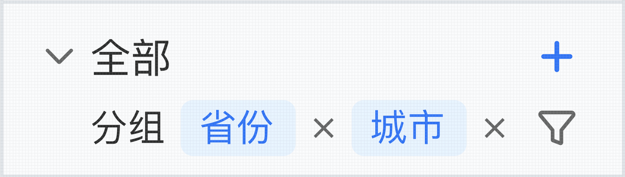
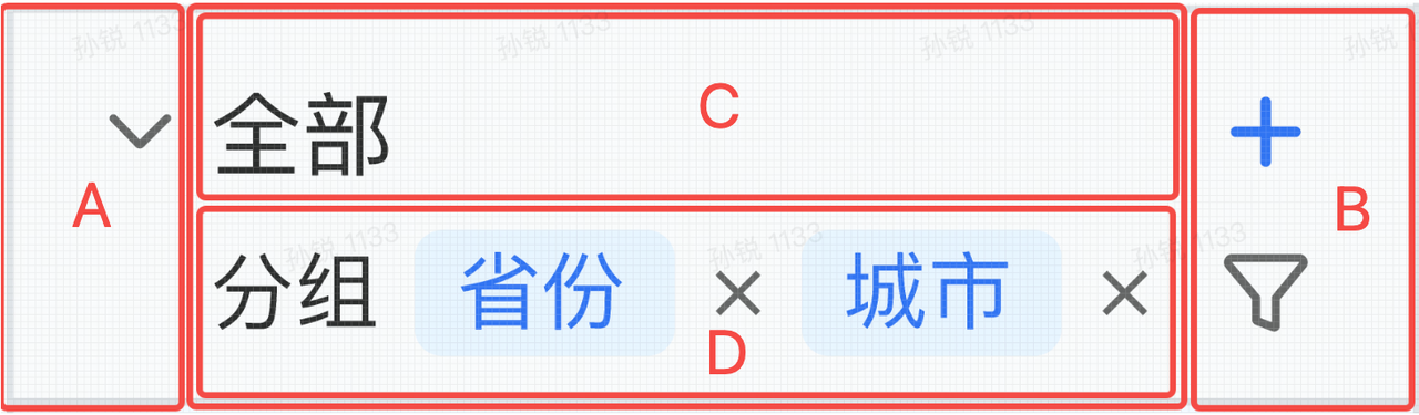
表头部分横向布局,分为三部分(A B CD):
- 左右两侧(A B),宽度像素指定(由 icon size 决定),高度为单元格高度
- 中间部分(CD)高度单元格高度,指定宽度单元格宽度 - AB 总宽度
中间部分纵向布局,分为两部分(C D):
- 上部(C)指定高度(由“全部”文字样式确定),宽度为父级 container 宽度
- 下部(D)不指定高度,宽度为父级 container 宽度,实际高度由布局结果确定,超过容器部分被截断
中间下部(D)横向布局,有三个 element:分组文字、省份按钮、城市按钮

其中省份按钮和城市按钮是多个 element 组合而成,整个容器的高度由布局折行结果决定,最小高度为不换行显示为一行;最大高度为三个 element 都折行显示,显示为三行
JSX 图元
详细说明请参考 VRender 提供的教程:VRender图元配置
容器图元
容器图元VGroup是盒模型布局容器,支持元素在其中自动布局;VGroup的子元素可以是VGroup,也可以是基础图元;布局支持配置以下属性
- display: 布局模式(
flex开启 flex 布局模式) - flexDirection: 主轴的方向
- flexWrap: 单行显示还是多行显示
- justifyContent: 行向轴分配内容元素之间和周围的空间规则
- alignItems: 交叉轴上的对齐规则
- alignContent: 主轴上的对齐规则
基础图元
基础的自定义图元,目前支持VRect VCircle VText VImage
| 图元类型 | 基础属性 |
|---|---|
| rect | width, height, stroke, fill, lineWidth, cornerRadius... |
| circle | radius, startAngle, endAngle, stroke, fill, lineWidth... |
| text | text, fontSize, fontFamily, fill... |
| image | image, width, height |
基础自定义组件,目前支持VTag VRadio VCheckbox
| 图元类型 | 基础属性 |
|---|---|
| tag | text, textStyle, shape, padding... |
| radio | checked, disabled, text, icon... |
| checkbox | checked, disabled, text, icon... |
图元可以配置boundsPadding属性,实现 margin 效果
boundsPadding: [marginTop, marginRight, marginBottom, marginLeft]
图元的 margin 会计算在图元所占的空间
图元状态更新及交互事件
在基础属性外,可以使用状态更新来实现 hover 等交互效果:
<VImage
  attribute={{
    id: 'row-down',
    image: collapseDown,
    width: 20,
    height: 20,
    cursor: 'pointer'
  }}
  states={{
    hover: {
      background: {
        fill: '#ccc',
        cornerRadius: 5,
        expandX: 1,
        expandY: 1
      }
    }
  }}
  onMouseEnter={event => {
    event.currentTarget.addState('hover', true, false);
    event.currentTarget.stage.renderNextFrame();
  }}
  onMouseLeave={event => {
    event.currentTarget.removeState('hover', false);
    event.currentTarget.stage.renderNextFrame();
  }}
></VImage>
通过绑定事件,更新图元状态,实现交互更新图元样式效果。
API
VRect
矩形图元
| key | type | description |
|---|---|---|
| width | number | 矩形宽度 |
| height | number | 矩形高度 |
| lineWidth | number | 描边宽度 |
| cornerRadius | number | 角弧度 |
| fill | string | 填充颜色 |
| stroke | string | 描边颜色 |
VCircle
圆形图元
| key | type | description |
|---|---|---|
| radius | number | 半径 |
| startAngle | number | 起始弧度 |
| endAngle | number | 结束弧度 |
| lineWidth | number | 描边宽度 |
| fill | string | 填充颜色 |
| stroke | string | 描边颜色 |
VText
文字图元
| key | type | description |
|---|---|---|
| text | string | 文字内容 |
| fontSize | string | 字号 |
| fontFamily | string | 字体 |
| fill | string | 文字颜色 |
VImage
图片图元
| key | type | description |
|---|---|---|
| width | number | 图片宽度 |
| height | number | 图片高度 |
| image | string | HTMLImageElement | HTMLCanvasElement | 图片内容 |
VLine
线图元
| key | type | description |
|---|---|---|
| points | {x: number, y: number}[] | 组成 line 的点坐标 |
| lineWidth | number | 描边宽度 |
| stroke | string | 描边颜色 |
VGroup
容器
| key | type | description |
|---|---|---|
| width | number | 容器宽度 |
| height | number | 容器高度 |
| display | 'relative' | 'flex' | 布局模式(flex开启 flex 布局模式) |
| flexDirection | 'row' | 'row-reverse' | 'column' | 'column-reverse' | 主轴的方向 |
| flexWrap | 'nowrap' | 'wrap' | 单行显示还是多行显示 |
| justifyContent | 'flex-start' | 'flex-end' | 'center' | 'space-between' | 'space-around' | 行向轴分配内容元素之间和周围的空间规则 |
| alignItems | 'flex-start' | 'flex-end' | 'center' | 交叉轴上的对齐规则 |
| alignContent | 'flex-start' | 'center' | 'space-between' | 'space-around' | 主轴上的对齐规则 |
VTag
标签组件
| key | type | description |
|---|---|---|
| textStyle | ITextGraphicAttribute | 文字样式,同 text 图元属性 |
| shape | TagShapeAttributes | 标签中图表的样式配置 |
| space | number | 图标与文字之间的距离 |
| padding | number[] | 内容与边框之间的距离 |
| panel | BackgroundAttributes | 外部边框及背景的样式,同 rect 图元属性 |
| minWidth | number | 最小宽度 |
| maxWidth | number | 最大宽度 |
VRadio
标签组件
| key | type | description |
|---|---|---|
| interactive | boolean | 是否可交互 |
| disabled | boolean | 是否禁用 |
| checked | boolean | 是否选中 |
| spaceBetweenTextAndIcon | number | 图标与文字间聚 |
| text | ITextGraphicAttribute | 文字样式,同 text 图元属性 |
| circle | {disableFill?: IColor;checkedFill?: IColor;checkedStroke?: IColor;disableCheckedFill?: IColor;disableCheckedStroke?: IColor;} | 图标样式 |
VCheckbox
标签组件
| key | type | description |
|---|---|---|
| interactive | boolean | 是否可交互 |
| disabled | boolean | 是否禁用 |
| checked | boolean | 是否选中 |
| indeterminate | boolean | 是否处于不确定状态 |
| spaceBetweenTextAndIcon | number | 图标与文字间聚 |
| text | ITextGraphicAttribute | 文字样式,同 text 图元属性 |
| icon | {checkIconImage?: string | HTMLImageElement |
| box | {disableFill?: IColor;checkedFill?: IColor;checkedStroke?: IColor;disableCheckedFill?: IColor;disableCheckedStroke?: IColor;} | 图表背景样式 |
CustomLayout 创建图元对象用法
- customLayout 支持对象创建的写法
CustomLayout 创建图元对象的写法,需要通过createXXX创建图元,具体创建时配置属性可以参考VRender图元配置
例如:
import { createText, createGroup } from '@visactor/vtable/es/vrender';

const text1 = new createText({
  text: 'text',
  fontSize: 28,
  fontFamily: 'sans-serif',
  fill: 'black'
});

const container = new createGroup({
  height,
  width
});
containerRight.add(text1);

return {
  rootContainer: container,
  renderDefault: false
};
动画
VTable支持在自定义布局中,使用VRender提供的动画能力,具体使用方法请参考VRender动画。需要注意的是动画需要配置为VTable实例上的timeline,以保证动画的一致性。
如果以JSX方式创建图元,需要在图元标签上添加animation属性和timeline。animation属性为一个数组,内是VRender动画中的操作,会在实例化对象后进行链式调用,例如:
<VImage
  attribute={{
    id: 'icon',
    width: 50,
    height: 50,
    src: record.bloggerAvatar,
    shape: 'circle',
    anchor: [25, 25]
  }}
  animation={[
    ['to', { angle: 2 * Math.PI }, 1000, 'linear'],
    ['loop', Infinity]
  ]}
  timeline={table.animationManager.timeline}
></VImage>
如果以实例化的方式创建图元,需要注意需要调用一次animation.setTimeline(table.animationManager.timeline);,例如:
import {createImage} from '@visactor/vtable/es/vrender';

const icon = createImage({
  id: 'icon',
  width: 50,
  height: 50,
  src: record.bloggerAvatar,
  shape: 'circle',
  anchor: [25, 25]
});
iconGroup.add(icon);

const animation = icon.animate();
animation.setTimeline(table.animationManager.timeline);
animation.to({ angle: 2 * Math.PI }, 1000, 'linear').loop(Infinity);