


PopTip组件
PopTip组件是VRender提供的一个弹出框组件,和常见的PopTip组件类似,用于在用户交互时展示一些额外信息。PopTip组件支持多种交互方式,PopTip组件可以自定义样式和内容,支持多种布局方式。
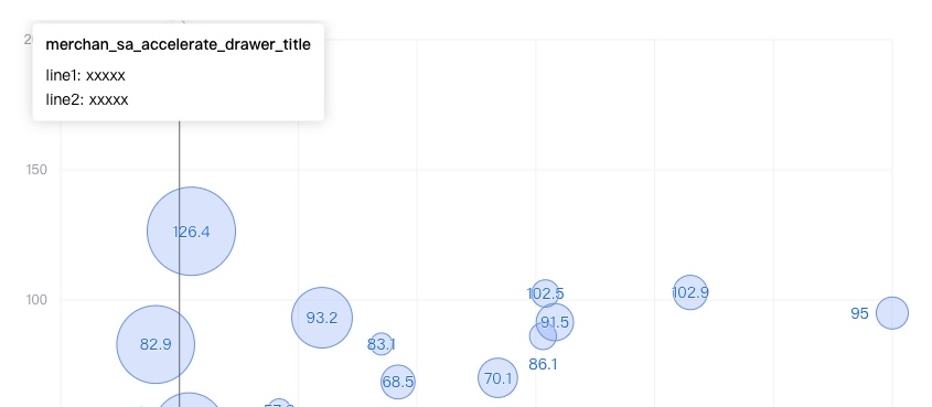
介绍
PopTip组件由以下几个部分构成:
title:PopTip组件的标题。content:PopTip组件的内容。panel:PopTip组件面板。
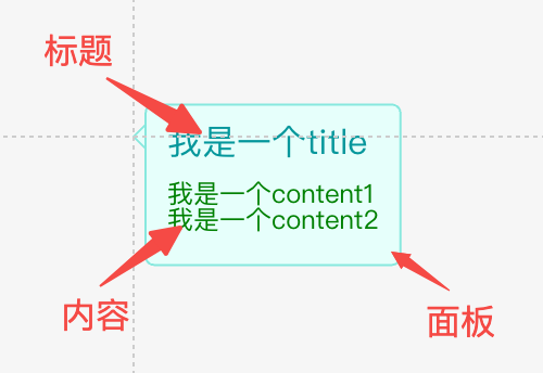
在配置层面,可配置PopTip的宽高,以及标题样式、内容样式均可配置,以及标题与内容的间距(space)、padding等布局属性也可以配置
对应的配置接口如下:
type PopTipAttributes = {
  /** 位置,参考arco design */
  position?: 'auto' | 'top' | 'tl' | 'tr' | 'bottom' | 'bl' | 'br' | 'left' | 'lt' | 'lb' | 'right' | 'rt' | 'rb';
  /**
   * 标题内容,如果需要进行换行,则使用数组形式,如 ['abc', '123']
   */
  title?: string | string[] | number | number[];
  /** 标题样式 */
  titleStyle?: Partial<ITextGraphicAttribute>;
  titleFormatMethod?: (t: string | string[] | number | number[]) => string | string[] | number | number[];
  /**
   * 内容文本,如果需要进行换行,则使用数组形式,如 ['abc', '123']
   */
  content?: string | string[] | number | number[];
  /** 内容文本样式 */
  contentStyle?: Partial<ITextGraphicAttribute>;
  // 内容格式化函数
  contentFormatMethod?: (t: string | string[] | number | number[]) => string | string[] | number | number[];
  /**
   * 标题与内容的间距
   */
  space?: number;
  /**
   * 内部边距
   */
  padding?: Padding;
  /**
   * 标签的背景面板配置, TODO: 支持symbol形状
   */
  panel?: BackgroundAttributes & ISymbolGraphicAttribute & { space?: number };

  /**
   * 最小宽度,像素值
   * @default 30
   */
  minWidth?: number;
  /**
   * 最大宽度,像素值。当文字超过最大宽度时,会自动省略。
   */
  maxWidth?: number;

  // 最大宽度比例
  maxWidthPercent?: number;

  visible?: boolean;
  visibleFunc?: (graphic: IGraphic) => boolean;
  state?: StateStyle;
  dx?: number;
  dy?: number;
} & Omit<IGroupGraphicAttribute, 'background'>
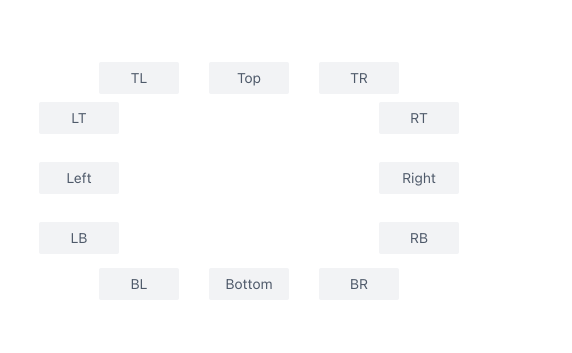
如图所示PopTip具有多种定位方式,你可以通过position属性来配置。同时也有一个auto的定位方式,它会根据PopTip的位置自动调整定位方式,避免PopTip被遮挡,尝试的位置顺序为['top', 'tl', 'tr', 'bottom', 'bl', 'br', 'left', 'lt', 'lb', 'right', 'rt', 'rb']。
PopTip会被内容默认撑开,可以通过配置minWidth和maxWidth设置其最大最小宽度,同时,如果不知道具体配置多大的像素,可以使用maxWidthPercent配置按照画面比例确定一个最大的宽度百分比。
使用
PopTip可以作为一般的组件使用,和普通的组件一样,可以通过xxx.add方法添加到场景树中,这种方法不具体介绍了。
同时我们还提供了插件(poptipForText)的形式进行使用。该插件会自动的识别画布中被截断的文字,当鼠标 hover 到该文字上的时候,会自动展示 PopTip 来显示完整内容。该插件不属于默认 bootstrap;未创建 App 前调用 loadPoptip(),已有 App 时调用 installPoptipToApp(app)。
- 我们可以通过在该图元上的
attribute.poptip属性进行展示的PopTip的样式配置,attribute.poptip属性的类型和PopTip组件接收的参数一致。而PopTip会自动填充上content的内容,用于展示文字的全部内容 - 创建 Stage 时在
pluginList中加入poptipForText,即可在该 Stage 上启用这个插件
这种使用场景中,我们的样式如果都在attribute.poptip中配置的话,会不太方便。所以PopTip插件提供了主题的配置,我们可以通过从@visactor/vrender-components包中导入setPoptipTheme属性来配置主题,主题的属性配置和PopTip组件的属性配置接口是一致的。插件会优先使用图元上定义的poptip属性,如果没有定义,则会使用主题配置,最后才会使用组件自身的配置。