


组件
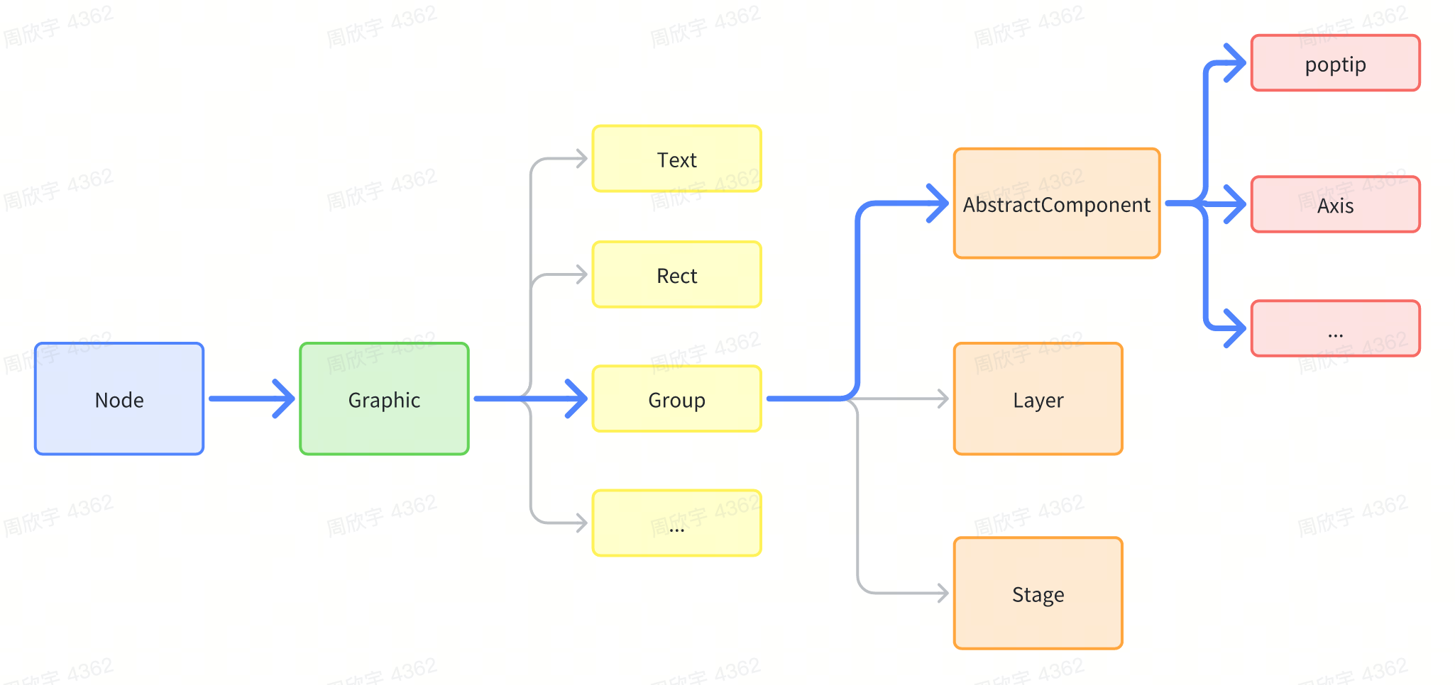
组件是特殊的图元,也是特殊的Group。VRender提供了一系列内置的组件,比如datazoom、axes、label、legend、poptip等,这些组件可以帮助我们快速实现一些常见的交互效果。外部也可以通过继承@visactor/vrender-components中的AbstractComponent来实现自定义组件。
介绍
组件是基于Group图元实现的,所以组件本身是一个特殊的Group图元,所有Group可以支持的配置都可以配置给组件中,但当然,一般情况下组件会抽象出一套专门的配置,用于定义该组件的特殊配置,组件内部既包含其他图元,也包含组件的逻辑,axes组件中包含了line图元、text图元、path图元等。不同类型的axes组件有不同的样式,同时axes组件中的标签实现了基于各种策略的防重叠逻辑。
使用组件
因为组件是基于Group图元实现的,所以在使用的时候,直接将其作为一个Group使用即可,只是这个Group内部自己会管理自己的子元素,有自己的状态。
如下为使用一个axes组件的例子:
const lineAxis = new LineAxis({
  x: 68,
  y: 30,
  start: {
    x: 0,
    y: 0
  },
  end: {
    x: 0,
    y: 400
  },
  pickable: true,
  visible: true,
  orient: 'left',
  line: {
    visible: false
  },
  label: {
    visible: true,
    inside: false,
    space: 12,
    autoLimit: true,
    style: {
      fontSize: 12,
      fill: '#89909d',
      fontWeight: 'normal',
      fillOpacity: 1
    },
    formatMethod: null
  },
  tick: {
    visible: false
  },
  subTick: {
    visible: false
  },
  title: {
    visible: false,
    text: 'visits',
    maxWidth: null
  },
  panel: {
    visible: false
  },
  verticalFactor: 1,
  items: [
    [
      {
        id: 0,
        label: 0,
        value: 1,
        rawValue: 0
      },
      {
        id: 500,
        label: 500,
        value: 0.780952380952381,
        rawValue: 500
      },
      {
        id: 1000,
        label: 1000,
        value: 0.5619047619047619,
        rawValue: 1000
      },
      {
        id: 1500,
        label: 1500,
        value: 0.3428571428571428,
        rawValue: 1500
      },
      {
        id: 2000,
        label: 2000,
        value: 0.12380952380952383,
        rawValue: 2000
      },
      {
        id: 24000,
        label: 24000,
        value: -0.0042307692307692315,
        rawValue: 24000
      }
    ]
  ],
});

const app = createBrowserVRenderApp();
const stage = app.createStage({
  canvas: 'main',
  autoRender: true
});

stage.defaultLayer.add(lineAxis);
window['stage'] = stage;
自定义组件
自定义组件比自定义图元更简单,不需要自定义render和pick,因为其使用的图元都是已有的图元,我们只需要在组件内实现自己的逻辑即可,就和react类似。
- 继承
AbstractComponent - 定义自身的
attribute,因为组件往往包含不同子元素模块,比如轴有轴标签、轴tick、轴线等,所以可以定义一个attribute接口,用于定义组件的属性。 - 重载
render函数,每次有效的属性更新都会调用render函数,在render函数里去创建和管理子元素。
一个简单的例子如下,比如我们要实现一个组件,它是一个装着圆形的盒子,传入圆形的数量,他就能画这个数量的圆形:
import { AbstractComponent } from '@visactor/vrender-components';
class CircleBox extends AbstractComponent<Required<CircleBoxAttributes>> {
  name = 'circleBox';

  static defaultAttributes: Partial<CircleBoxAttributes> = {
    circleStyle: {
      fill: 'red',
    },
    circleCount: 10,
    width: 300,
    height: 300
  };

  constructor(attributes: PopTipAttributes, options?: ComponentOptions) {
    super(options?.skipDefault ? attributes : merge({}, CircleBox.defaultAttributes, attributes));
  }

  // 每次合法属性更新都会调用
  protected render() {
    const { circleCount, circleStyle, width, height } = this.attribute;

    const minWH = Math.min(width, height);
    const count = Math.ceil(Math.sqrt(circleCount));
    const radius = Math.floor(minWH) / count / 2;
    for (let i = 0; i < circleCount; i++) {
      // 计算子元素的位置
      const x = (i % count) * radius * 2 + radius;
      const y = Math.floor(i / count) * radius * 2 + radius;
      // 添加或创建子元素
      const circle = this.createOrUpdateChild(`circle-${i}`, { ...circleStyle, radius, x, y }, 'circle');
    }
  }
}
自定义完成后,就可以像使用其他组件一样使用了。