如何在表格组件中加入进度图?
问题描述
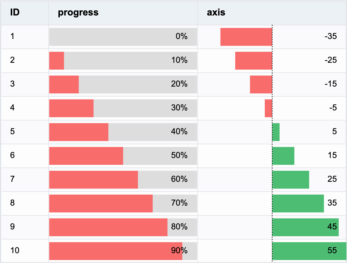
表格中指定一列,内容按照数据显示为进度图,并显示百分比文字。如何在VTable中实现这个效果?
解决方案
可以通过在 columns 中将 cellType 设置为 progressbar,指定该列为 progressbar 类型(进度图)单元格;通过配置 columns 中的 style,可以配置进度图的样式:
{
    field: "value",
    title: "progress",
    cellType: "progressbar",
    style: {
      barColor: DEFAULT_BAR_COLOR,
      barBgColor: "#ddd",
      barHeight: 30,
      barBottom: 4,
      textAlign: "right"
    },
    fieldFormat: (data: any) => {
      return data.value + "%";
    },
    width: 250
}
在 style 中:
- barColor: 进度条颜色,可以配置为函数来改变不同进度的颜色
- barBgColor: 进度条背景颜色
- barHeight: 进度条高度,支持配置百分比
- barBottom: 进度条距离底部高度,支持配置百分比
- ......
通过
fieldFormat,可以修改单元格中的文字内容,显示百分比文字。 通过修改barType,可以将进度图改为简单的柱图,可以用来显示同时存在正负数据的内容。
代码示例
const columns = [
  {
    field: 'id',
    title: 'ID',
    width: 80
  },
  {
    field: 'value',
    title: 'progress',
    cellType: 'progressbar',
    style: {
      barColor: DEFAULT_BAR_COLOR,
      barBgColor: '#ddd',
      barHeight: 30,
      barBottom: 4,
      textAlign: 'right'
    },
    fieldFormat: (data: any) => {
      return data.value + '%';
    },
    width: 250
  },
  {
    field: 'value1',
    title: 'axis',
    cellType: 'progressbar',
    barType: 'negative',
    min: -50,
    max: 50,
    style: {
      barHeight: 30,
      barBottom: 4,
      textAlign: 'right'
    },
    width: 250
  }
];
const option: TYPES.ListTableConstructorOptions = {
  records,
  columns
};
结果展示