


折线图和柱状图如何同时展示?
问题描述
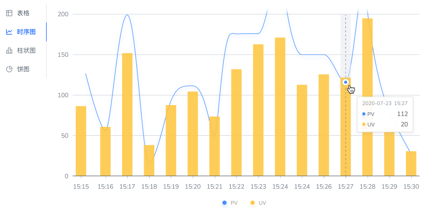
如图所示,我想在我的产品中添加一个这样的图表,pv 用折线图展示 uv 用柱状图展示,应该如何实现?
解决方案
一开始以为你是希望做一个双轴图,仔细看了后发现并不是。双轴图会在图的左右两边各有一个坐标轴,而你真正的需求是组合图,在一个坐标系中渲染多组系列。
并不是所有的图表库都支持多系列绘图,这里我使用 VChart 为例:
指定两个系列分别是 bar 和 line,图表类型选择common即可。
代码示例
const spec = {
  type: 'common',
  seriesField: 'color',
  data: [
    {
      id: 'id0',
      values: [
        {
          x: 'Monday',
          type: 'Breakfast',
          y: 15
        },
        {
          x: 'Monday',
          type: 'Lunch',
          y: 25
        },
        {
          x: 'Tuesday',
          type: 'Breakfast',
          y: 12
        },
        {
          x: 'Tuesday',
          type: 'Lunch',
          y: 30
        },
        {
          x: 'Wednesday',
          type: 'Breakfast',
          y: 15
        },
        {
          x: 'Wednesday',
          type: 'Lunch',
          y: 24
        },
        {
          x: 'Thursday',
          type: 'Breakfast',
          y: 10
        },
        {
          x: 'Thursday',
          type: 'Lunch',
          y: 25
        },
        {
          x: 'Friday',
          type: 'Breakfast',
          y: 13
        },
        {
          x: 'Friday',
          type: 'Lunch',
          y: 20
        },
        {
          x: 'Saturday',
          type: 'Breakfast',
          y: 10
        },
        {
          x: 'Saturday',
          type: 'Lunch',
          y: 22
        },
        {
          x: 'Sunday',
          type: 'Breakfast',
          y: 12
        },
        {
          x: 'Sunday',
          type: 'Lunch',
          y: 19
        }
      ]
    },
    {
      id: 'id1',
      values: [
        {
          x: 'Monday',
          type: 'Drinks',
          y: 22
        },
        {
          x: 'Tuesday',
          type: 'Drinks',
          y: 43
        },
        {
          x: 'Wednesday',
          type: 'Drinks',
          y: 33
        },
        {
          x: 'Thursday',
          type: 'Drinks',
          y: 22
        },
        {
          x: 'Friday',
          type: 'Drinks',
          y: 10
        },
        {
          x: 'Saturday',
          type: 'Drinks',
          y: 30
        },
        {
          x: 'Sunday',
          type: 'Drinks',
          y: 50
        }
      ]
    }
  ],
  series: [
    {
      type: 'bar',
      dataIndex: 0,
      label: {
        visible: true
      },
      seriesField: 'type',
      dataIndex: 0,
      xField: ['x', 'type'],
      yField: 'y'
    },
    {
      type: 'line',
      dataIndex: 1,
      label: {
        visible: true
      },
      seriesField: 'type',
      xField: 'x',
      yField: 'y',
      stack: false
    }
  ],
  axes: [
    {
      orient: 'left'
    },
    {
      orient: 'bottom',
      label: {
        visible: true
      },
      type: 'band'
    }
  ],
  legends: {
    visible: true,
    orient: 'bottom'
  }
};
结果展示
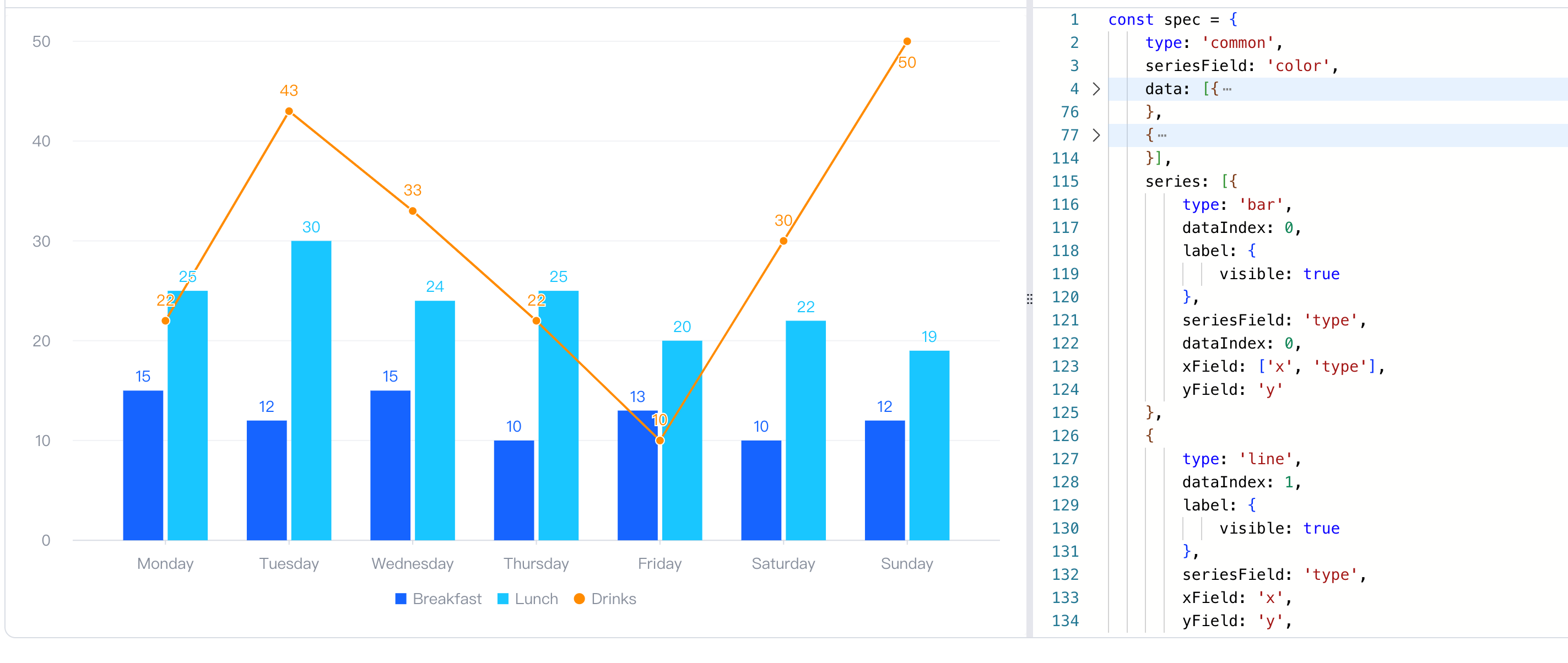
Demo: https://visactor.io/vchart/demo/combination/single-region?keyword=commonChart
相关文档
Common Chart option: https://visactor.io/vchart/option/commonChart
github: https://github.com/VisActor/VChart
Series tutorials: https://visactor.io/vchart/guide/tutorial_docs/Chart_Concepts/Series/Composition_and_Effect_of_Series