


如何配置坐标轴的范围?
问题描述
在双轴图里,右边的坐标轴表示的是百分比,这个百分比的范围可以手动配置吗?我用的是 vchart 的,我配置了 min 和 max 但是没有生效。具体配置:
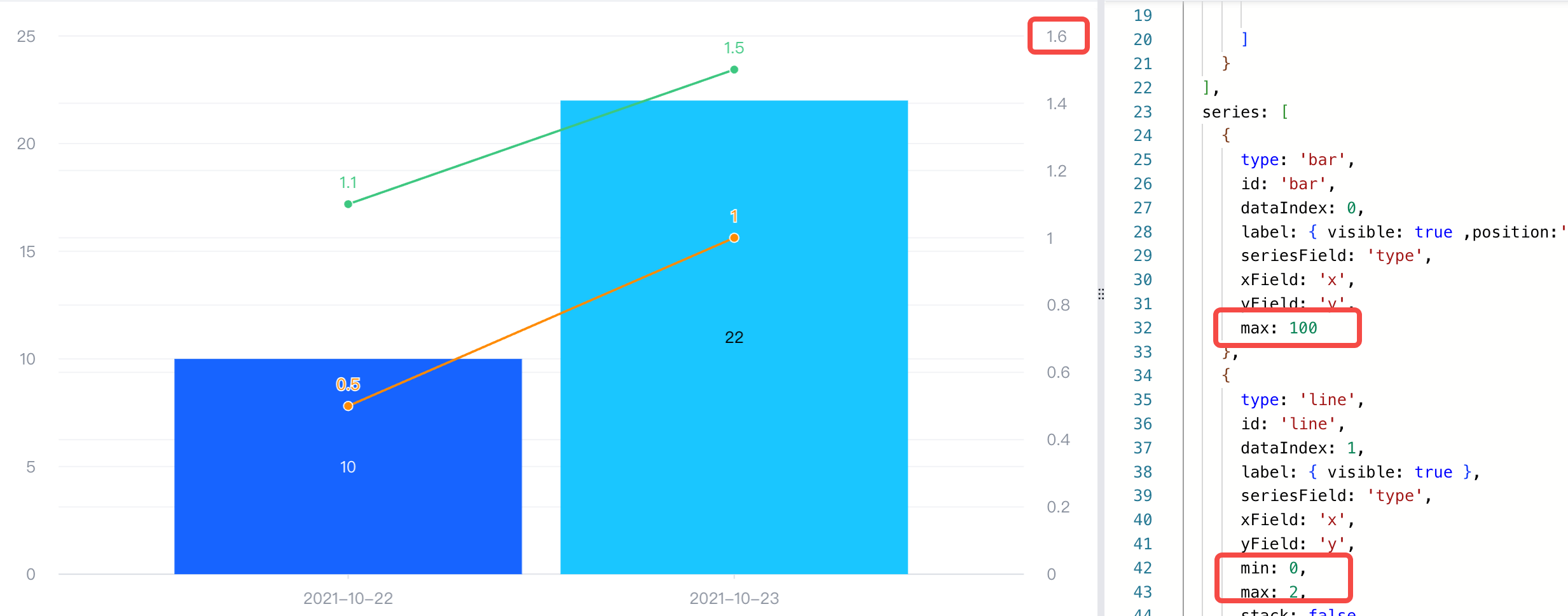
{
  type: 'common',
  seriesField: 'color',
  data: [
    {
      id: 'id0',
      values: [
        { x: '2021-10-22', type: 'A', y: 10 },
        { x: '2021-10-23', type: 'B', y: 22 },
      ]
    },
    {
      id: 'id1',
      values: [
        { x: '2021-10-22', type: 'TA', y: 0.5 },
        { x: '2021-10-22', type: 'TB', y: 1.1 },
        { x: '2021-10-23', type: 'TA', y: 1 },
        { x: '2021-10-23', type: 'TB', y: 1.5 },

      ]
    }
  ],
  series: [
    {
      type: 'bar',
      id: 'bar',
      dataIndex: 0,
      label: { visible: true ,position:'inside'},
      seriesField: 'type',
      xField: 'x',
      yField: 'y',
      max: 100
    },
    {
      type: 'line',
      id: 'line',
      dataIndex: 1,
      label: { visible: true },
      seriesField: 'type',
      xField: 'x',
      yField: 'y',
      min: 0,
      max: 2,
      stack: false
    }
  ],
  axes: [
    { orient: 'left', seriesIndex: [0] },
    { orient: 'right', seriesId: ['line'], grid: { visible: false }},
    { orient: 'bottom', label: { visible: true }, type: 'band' }
  ],
}
解决方案
轴范围的配置在 axes 配置项里,并不是在 series 上。你可以根据需要配置最小值(min)和最大值(max), 例如:
axes: [
  { orient: 'left', max: 100 },
  { orient: 'right', min:0, max:2 },
],